After
The prototype may take couple secs to load
*Equipment Illustration credit to Freepik
Imagine this
Finally, you are about to hit the gym for the first time.
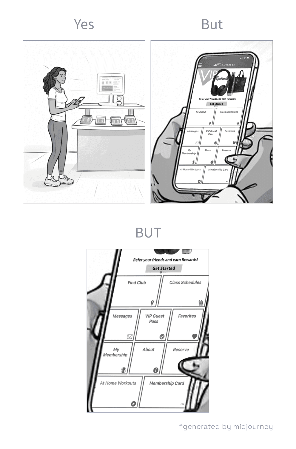
Standing at the check-in counter, you open the app. You're immediately greeted by a wall of 11 buttons that all look similar. However, the check-in button, the one you really need right now, is camouflaged among its 10 buddies.
It's peak hour after work, people are lining up behind you.
You begin to panic.
Would you call this a major setback?
That was me when I stepped into LA Fitness for the first time. Deciding to really focus on my health is already a challenge, and it didn't take long for me to see:
Hitting the gym is hard,
and this app is not making it any easier :(
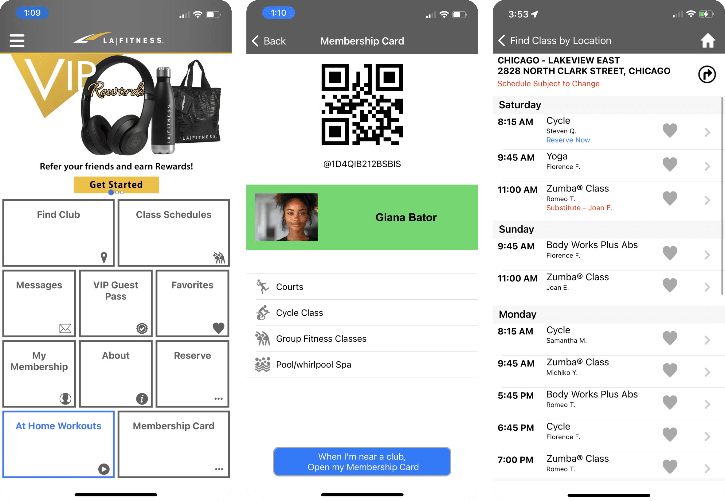
A glimpse of the current UI
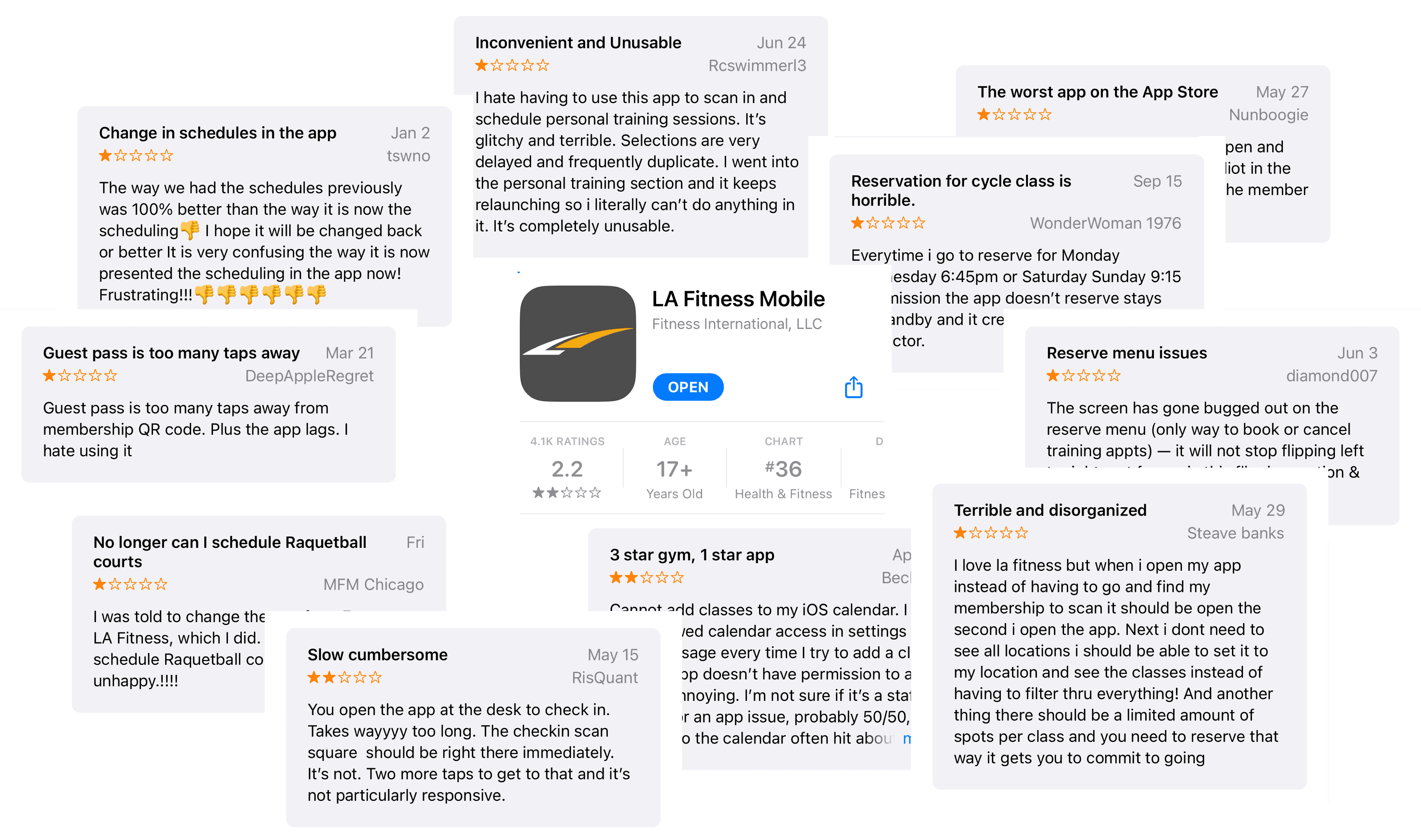
And I’m not the only one feeling this way — lots of other users are frustrated too, judging by the negative comments and that rough 2.2-star rating in the app store.
“You open the app at the desk to check in. Takes wayyy too long. The checkin scan square should be right there immediately."
“…instead of having to go and find my membership to scan it should be open the second I open the app"
“…it is very confusing the way it is now presented the scheduling in the app now"
“I hate having to use this app to scan in and schedule personal training sessions."
But hey looking on the bright side — it means there’s room for improvement now.
Problem
Users find it challenging to navigate the interface and locate essential information, which hinders their ability to utilize the app effectively, ultimately threatens long-term customer retention.
More than a UI Problem, it diminishes the business potential
When resources are tight, functionality matters more than UI. But if the way it looks interfere with functionality and business potential, a reshaping is in desperate need.
I summed up 3 major reasons why LA Fitness app needs a refresh:
1
2
3
As for reason 3, the parent company of LA Fitness is debuting a new upscale concept called Club Studio. This might create a great opportunity to initiate a complete rebranding of the digital experience across the parent company. Find more about this here.
Define 4 Major Frustrations
With insights gained from talking to some friendly faces in the gym, and digging in the online community, instead of a whole make-over, I decided to tackle major frustrations.
Check-in takes too many clicks
Clustered navigation
Reserve and modify class schedule is a mess
Reserve a personal trainer is intimidating*
Personal training is a huge opportunity in terms of revenue growth. It takes up about 12.5% of the revenue for gym clubs in the US, according to a research from IBIS World.
Despite of this, LA Fitness app doesn't offer clear access their personal training service, let alone expect users to pay for it.
How Competitors Address those Issues
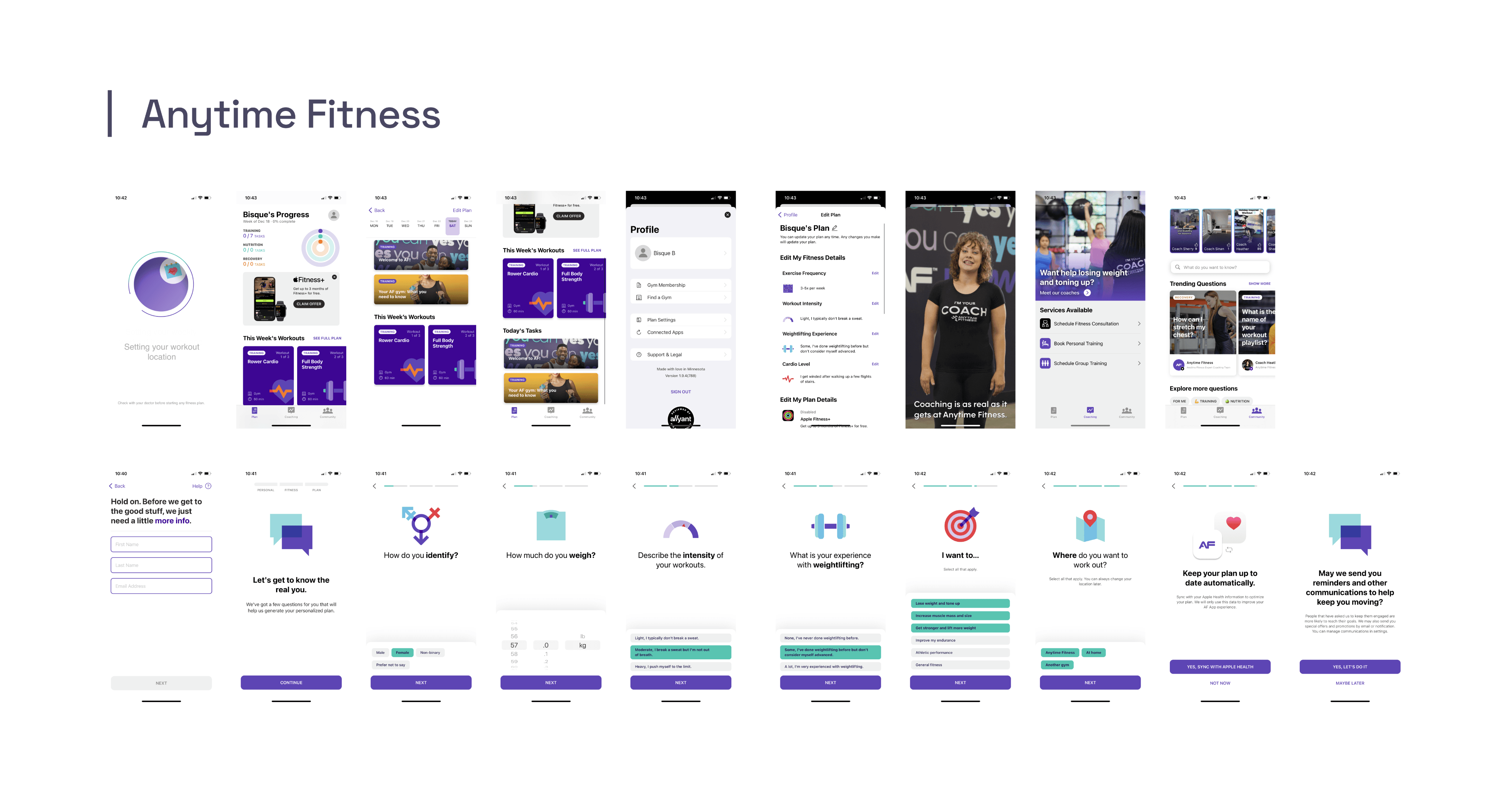
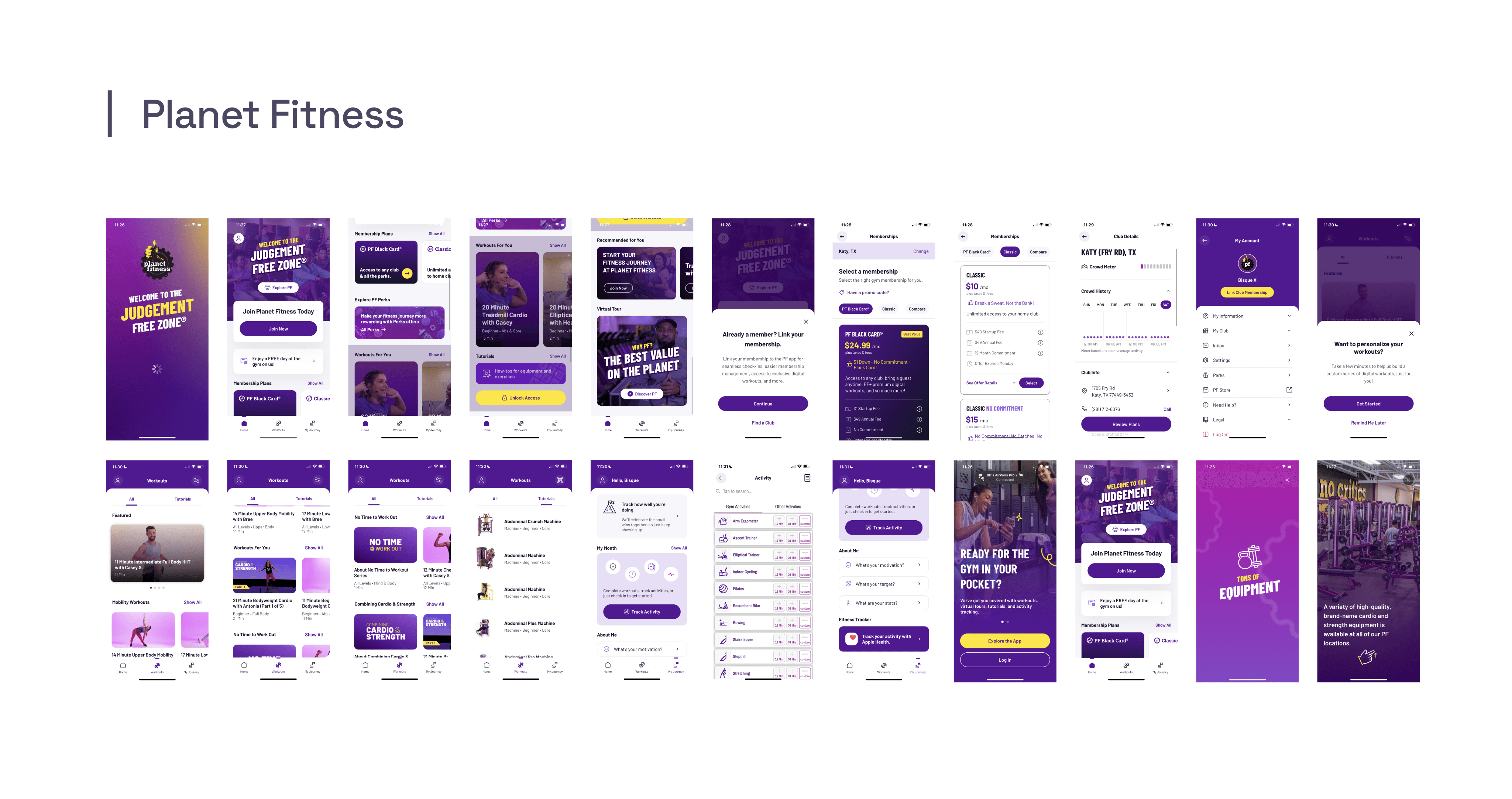
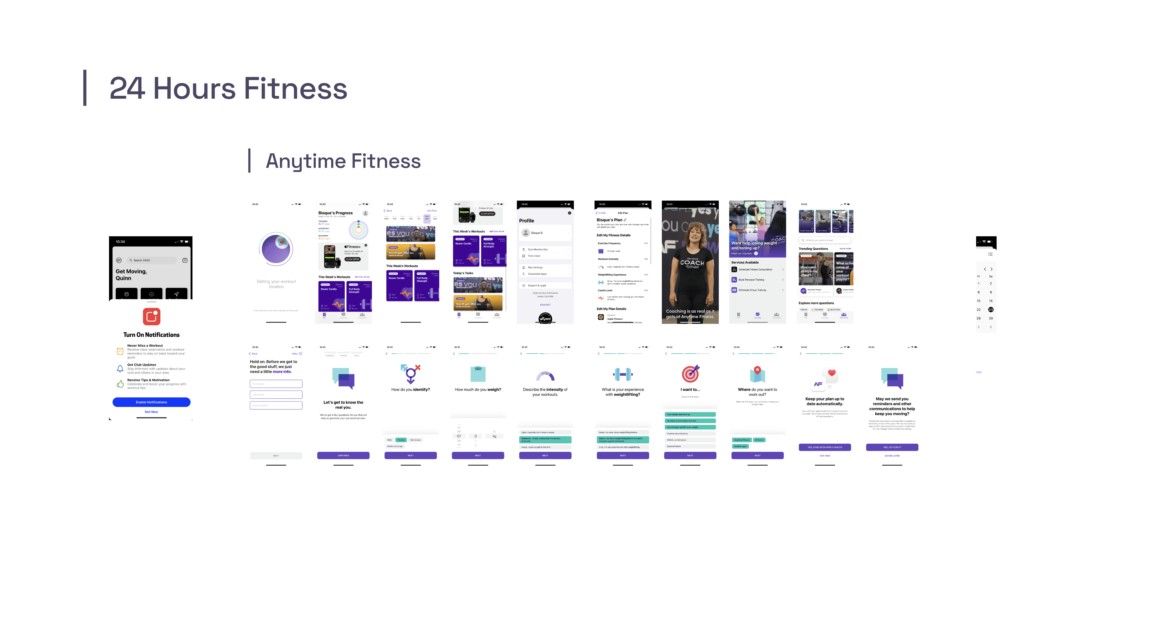
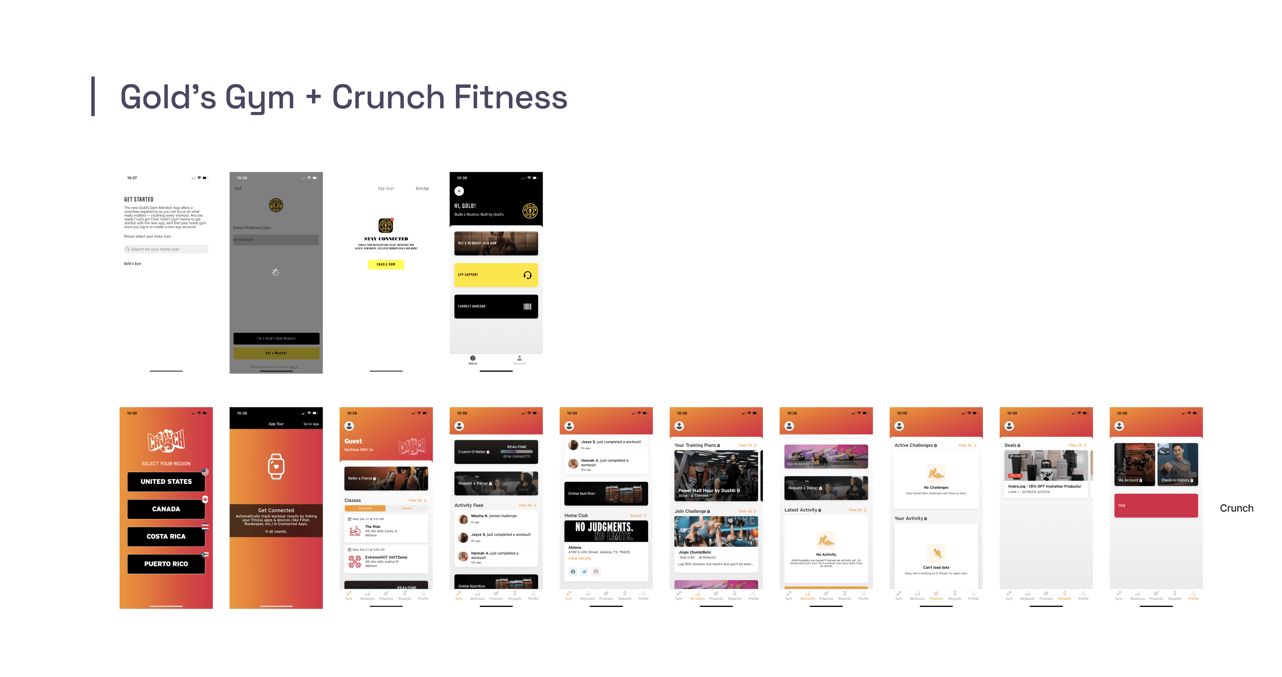
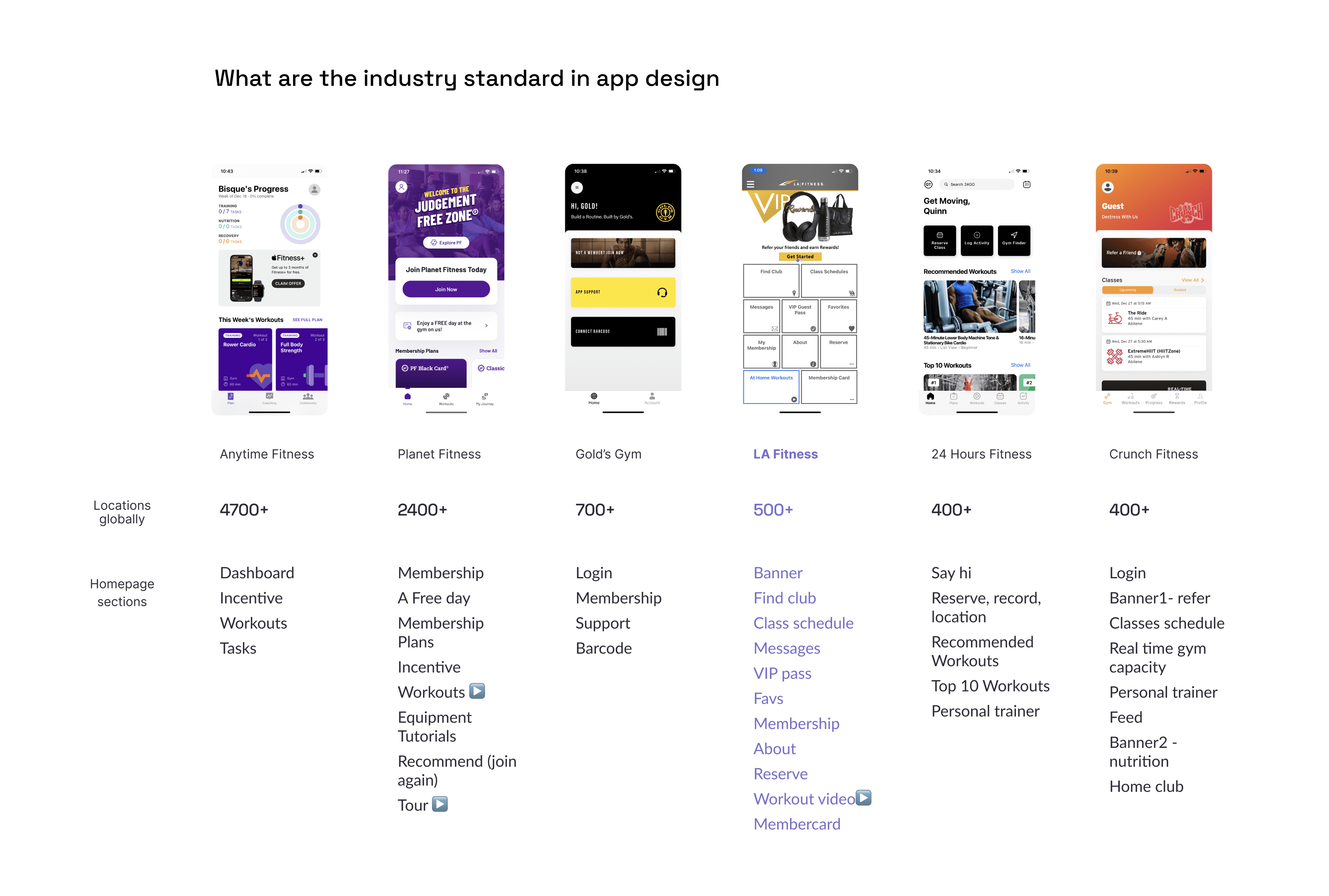
To figure out what competitors out there are really doing, I analyzed the app of five major players in the fitness industry. Here's the gist: while other competitors have jumped on the progress of the 2020s, LA Fitness seems to be stuck in the 2010s.
scroll to see competitors review
I also took the opportunity to drew inspiration from these competitors. What’s the main focus on their home screen? What stands out the most? I went through the home section by section, spotted common features, prioritized the sections, and decided to focus on six key features.
6 key functions
Dashboard / Join us reminder
My schedule
Equipment tutorial
Check-in
Reservation
Workout guide
I will address how I tackled the first two frustrations: clustered navigation, and the tedious check-in process.
Restructuring Information Hierarchy
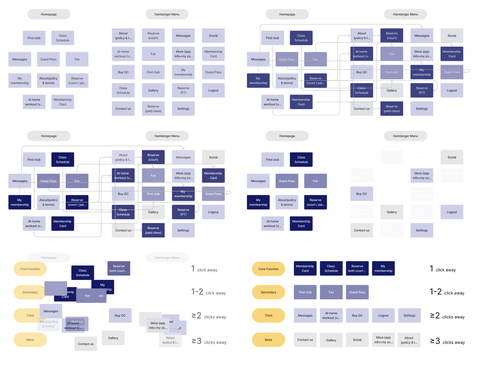
The current navigation, homepage and sidebar included, has a total of 29 items (this is more than a cognitive load, it's a cognitive truck)
Of course, some functions overlap, and there’s no clear hierarchy.
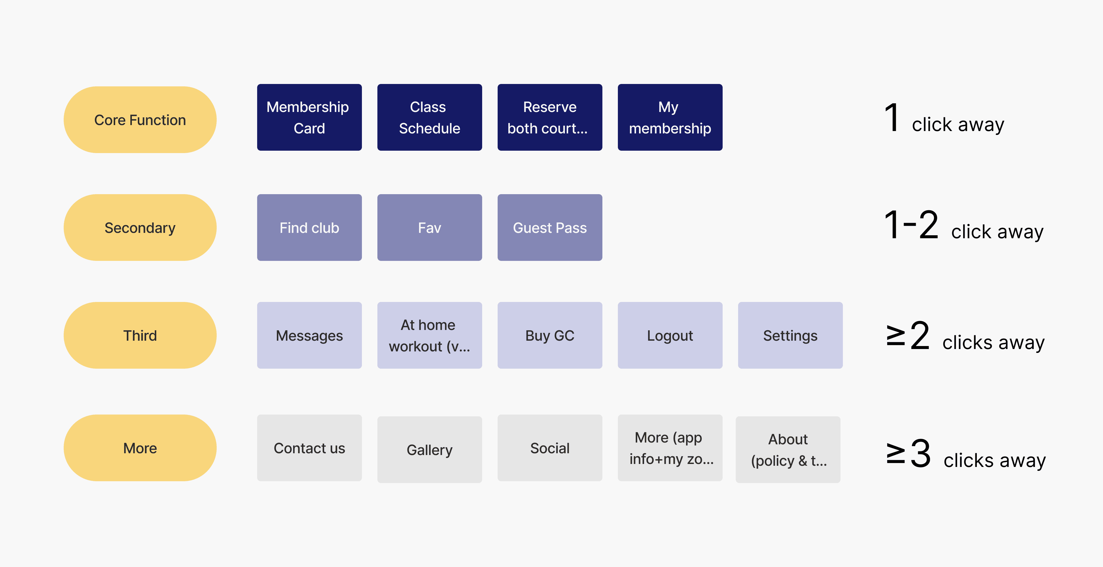
By cutting out the repetitive options, i managed to regroup them to different tiers based on priority and how often they’re used.
This is a key step for me to make better decisions on feature placement in the app.
· A rule of thumb is to limit the maximum click to complete a task in different tiers.
· It helps to quantify navigation efficiency
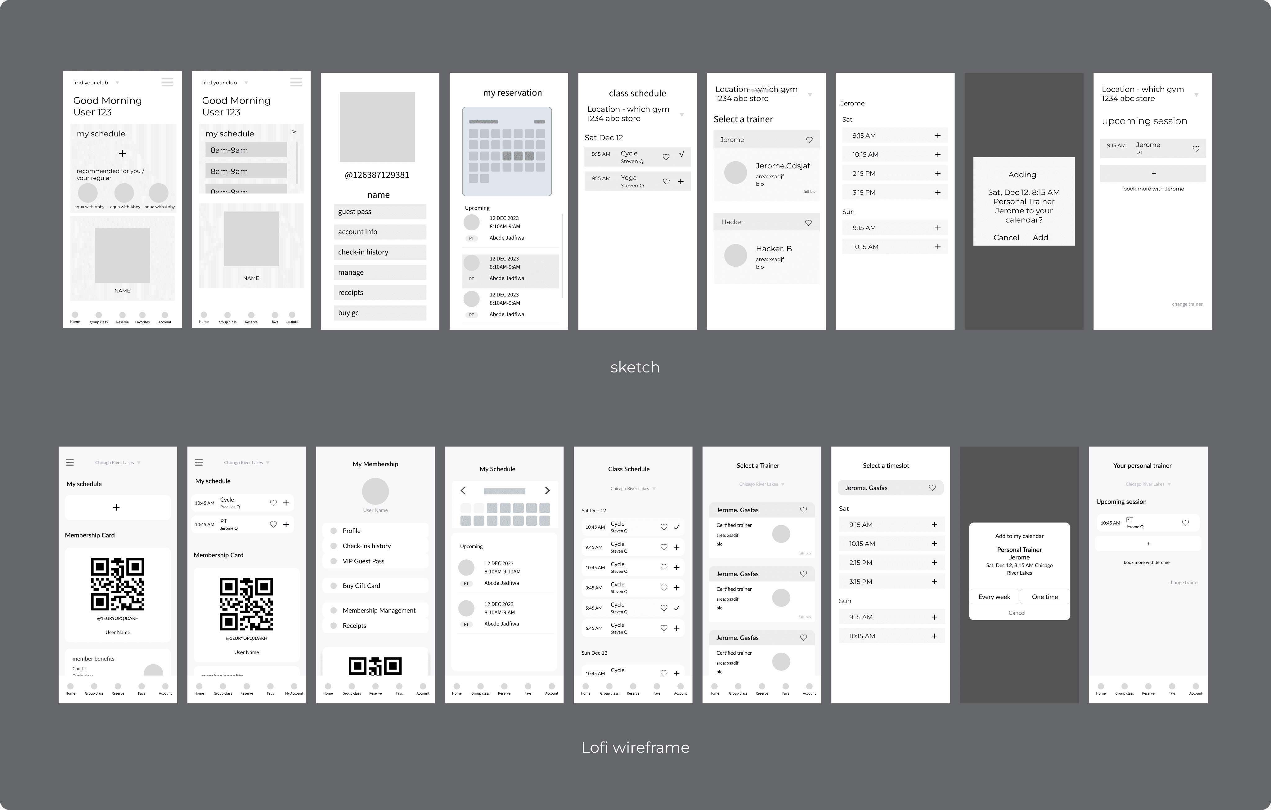
Lo-fi Wireframe
How I Made Check-in Process More Seamless
When initially sketching wireframes for check-in function, my approach was mostly brutal:
Featuring the most gigantic membership code on the home screen, you can't miss it ↓
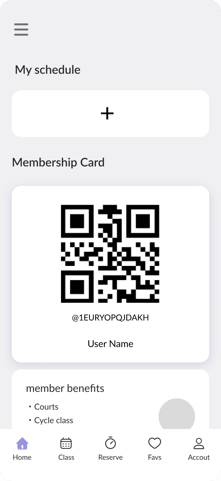
Option A
But this idea didn’t grow on me. As I found out there were some constraints in both technology and business sides:
Technical Constraint - The ability to automatically refresh the QR code might be limited by the platform's restrictions
Missing Business Opportunities - users may focus on the QR code without fully engaging with other features
So I continued exploring more options.
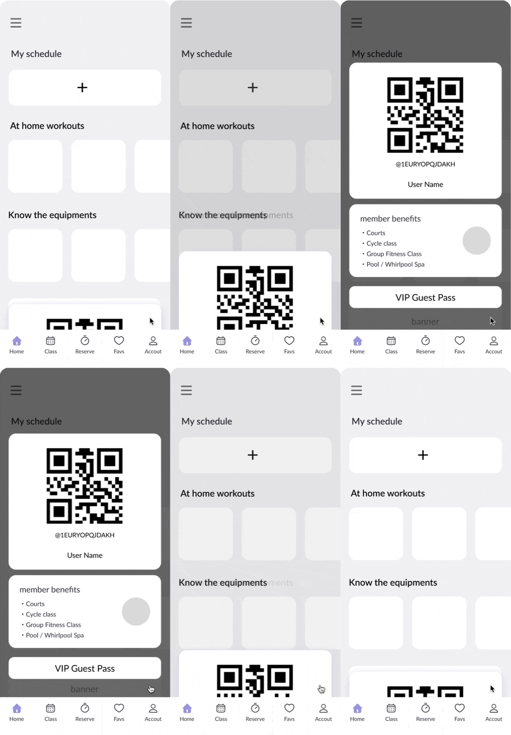
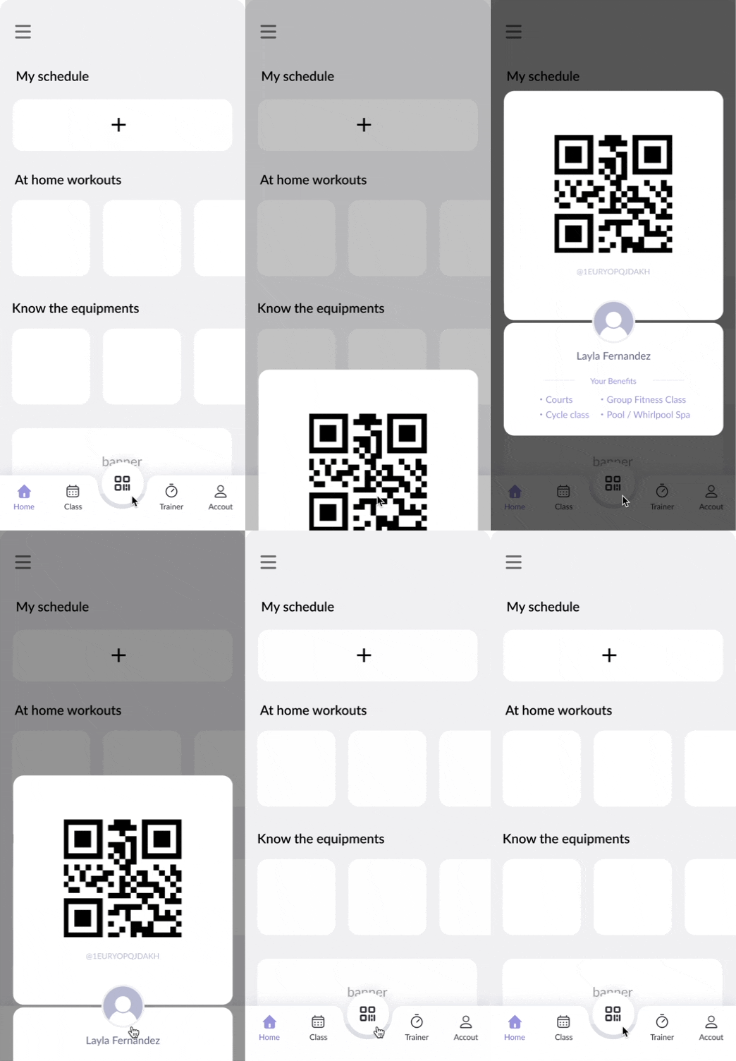
Option A
Option B
Option C
explore different ways of check-in code design
Option A:
featuring a giant membership code upon opening, center of the viewport, zero click needed
Option B:
featuring a peek of the membership code at the bottom, mimicking a physical card in a card holder
Option C:
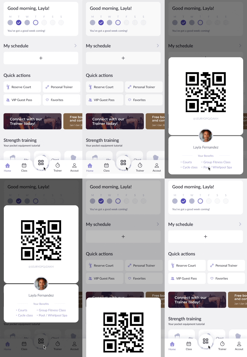
featuring a prominent middle button in the bottom navigation bar
I tested it with couple friends, 7/10 of them opt for option C.
Why Option C stands out
Consistency–no matter where you are in the app, you can always navigate to the code in one click
Eye catchiness–It’s prominent without being too distractive
Seamless integration–users can interact with the QR code while still noticing other features
4 Frustrations to 4 Opportunities
The goal I keep in mind during the revamping process is simple:
Simple user flow, short task completion time.
Check-in takes too many clicks
One tap check in
1
One tap check-in
Streamline check-in experience to speed up entry, reduces frustration at the setout
hover over the image to see before
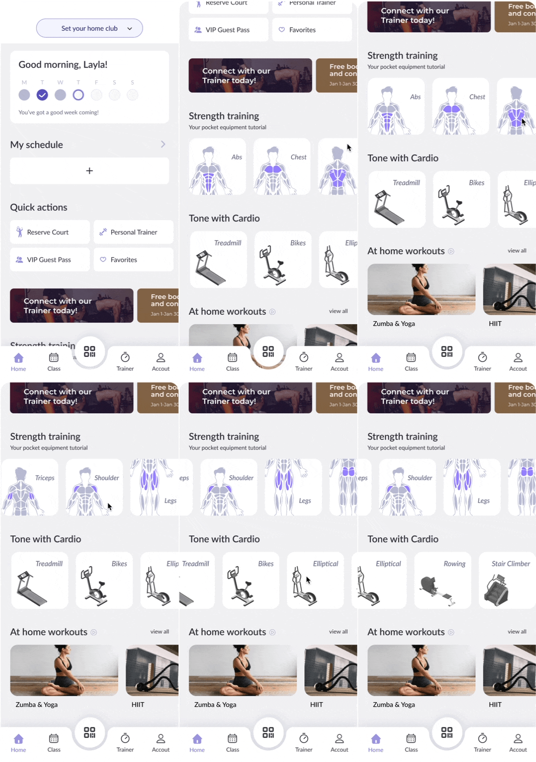
Clustered navigation
2
Optimized Navigation
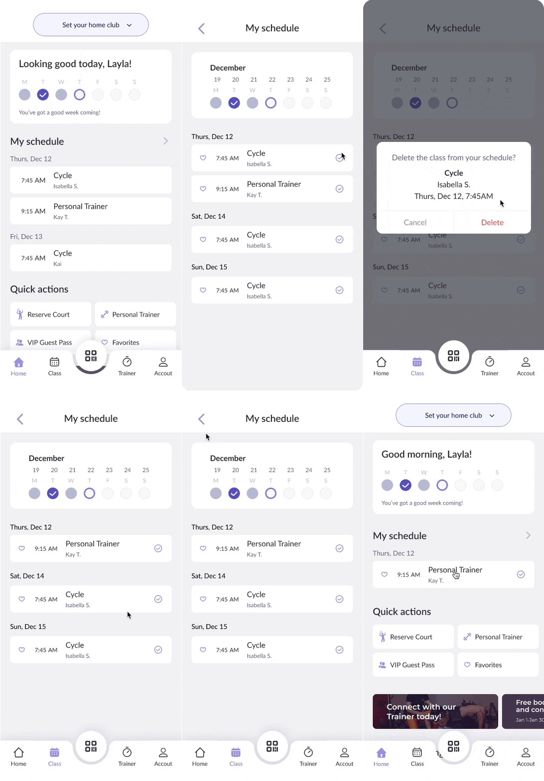
Personalized homepage–people value a product more if they feel it's theirs. A personalized section featuring a greeting and schedule could enhance this endowment effect.
Scrollable sections– unpack more content while maintaining a compact look
Opt bottom navigation–ensure high frequency functions are more accessible
hover over the image to see before
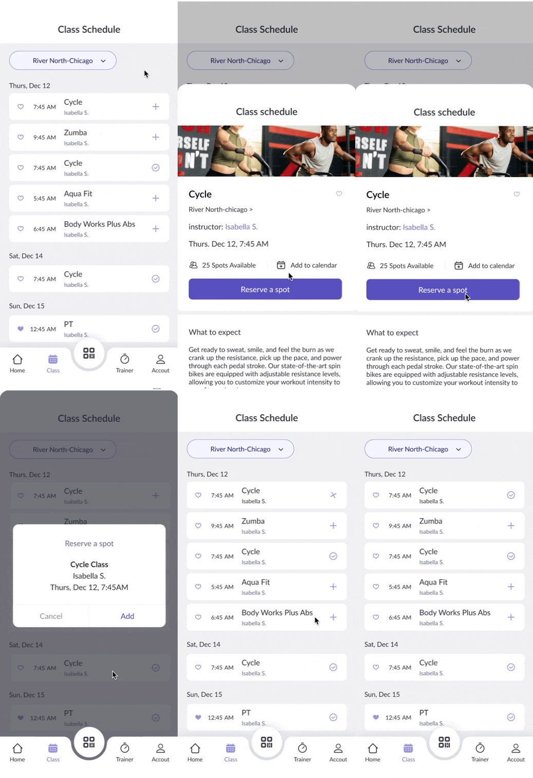
Reserve and modify class schedule is a mess
3
Intuitive class booking
Reservation portal–a schedule management portal with user-friendly interaction
Optimized UI–improve clarity of complex information.
hover over the image to see before
Reserve a personal trainer is intimidating*
4
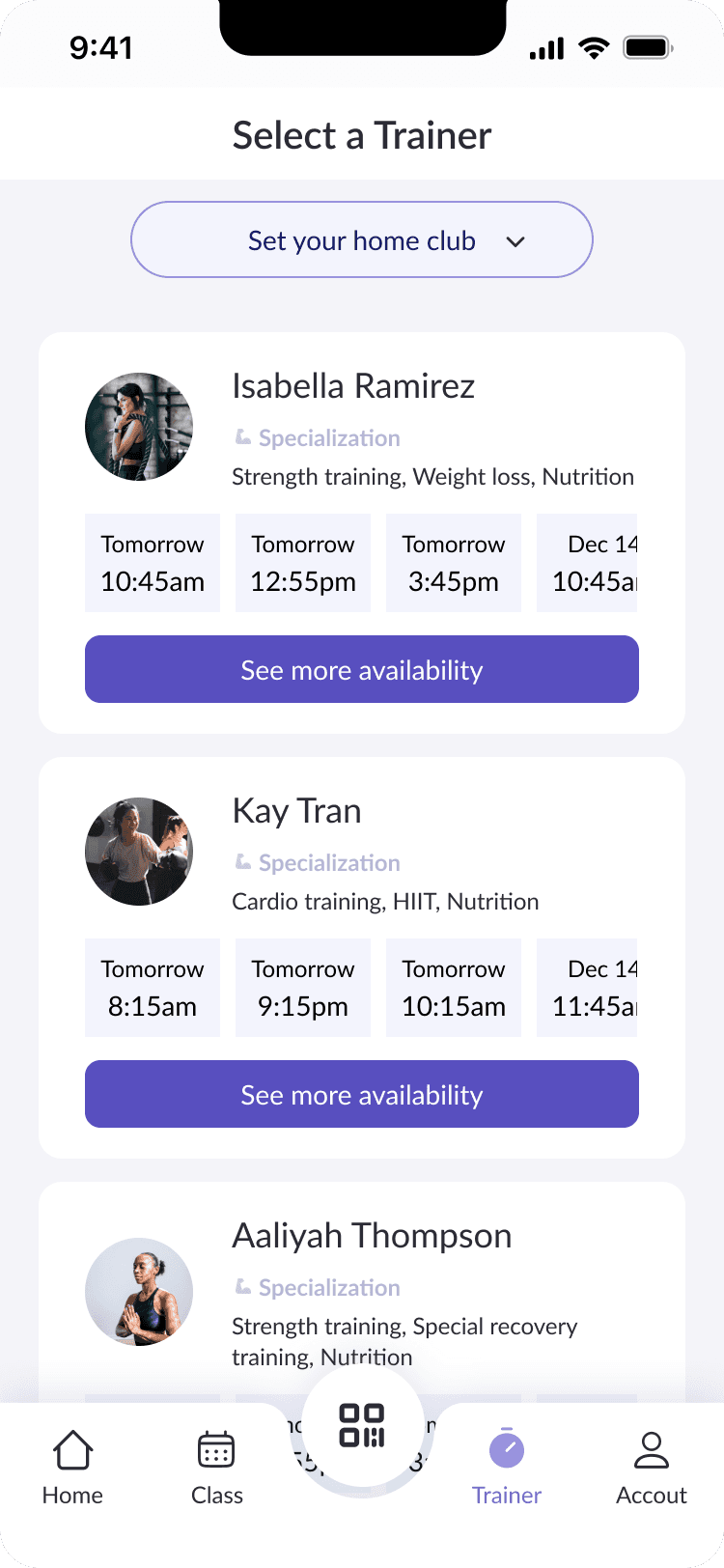
Enhanced trainer booking
From 5 taps to 1–achieve a higher task completion rate to drive more sales
Informative–allow users to gain additional insights about the trainer prior to booking a session
hover over the image to see before
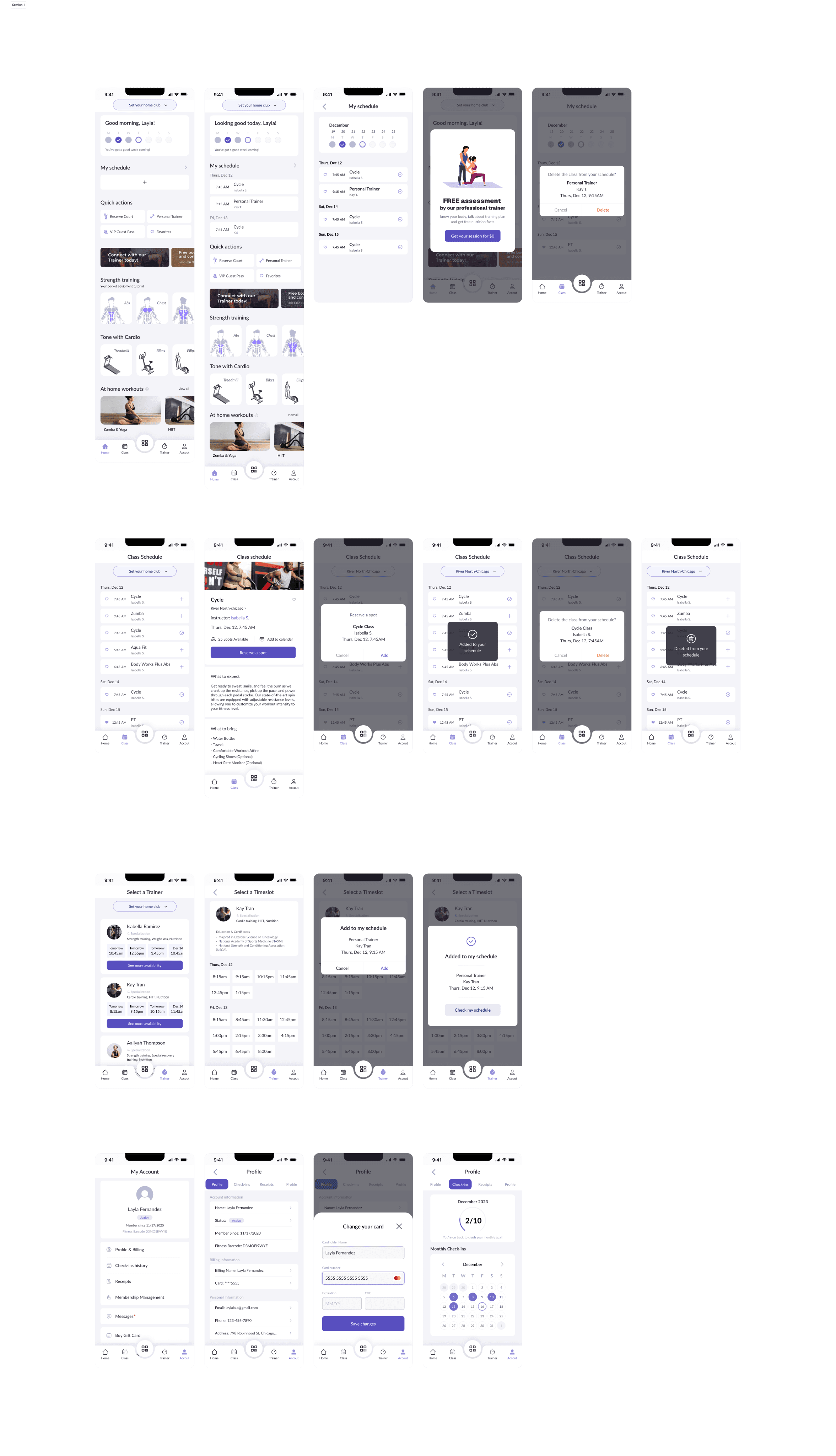
Hi-fi Wireframe
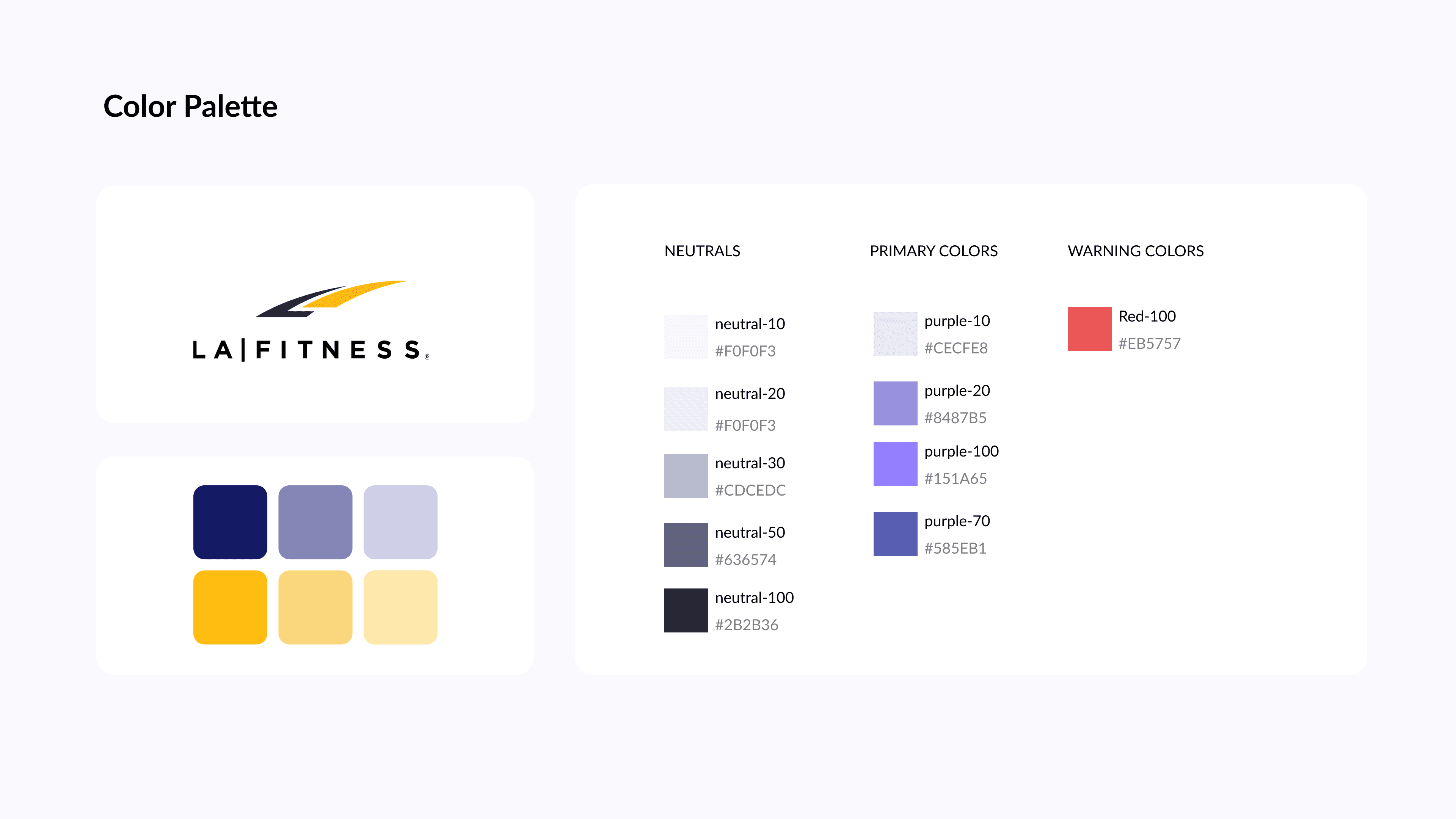
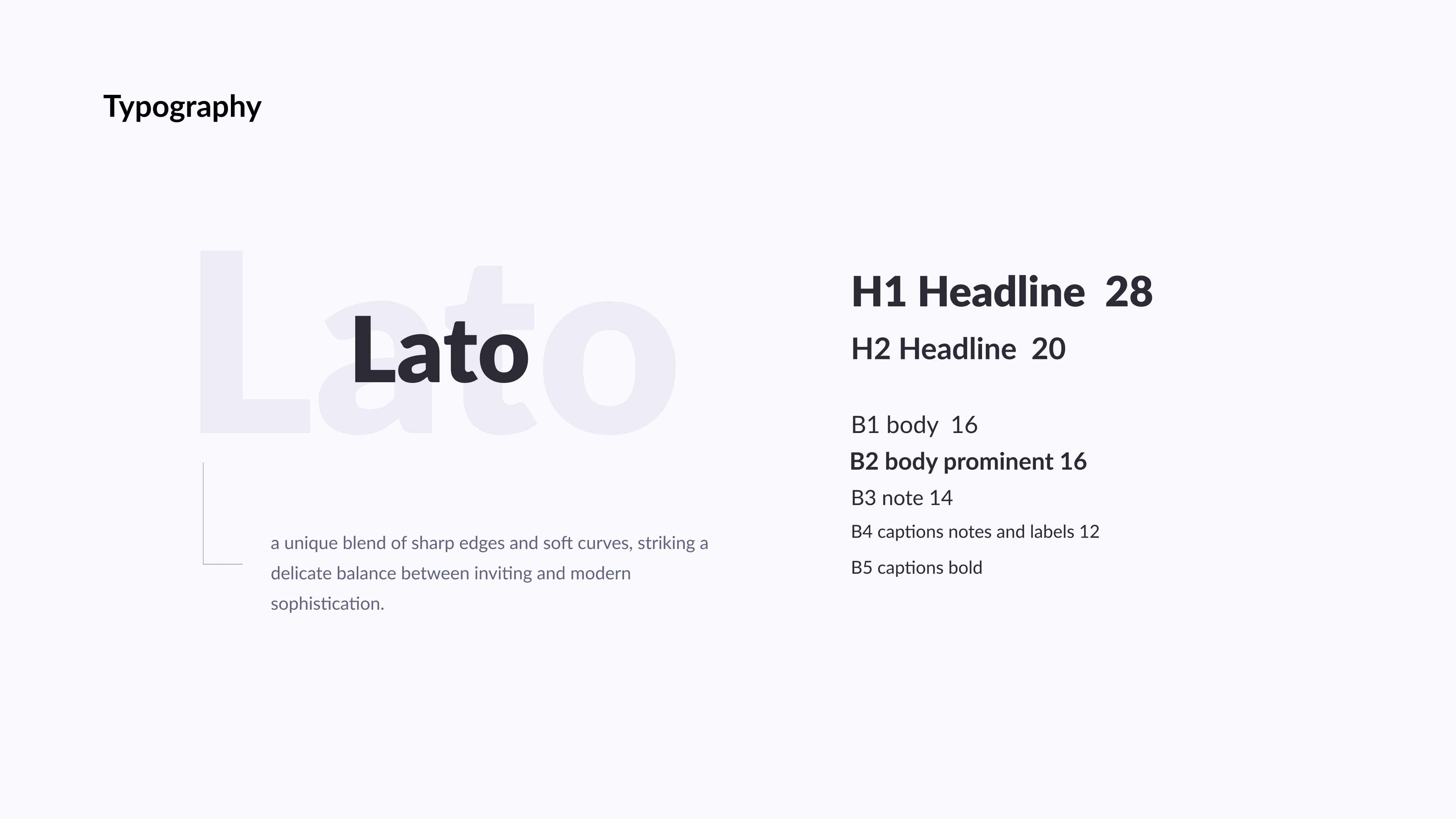
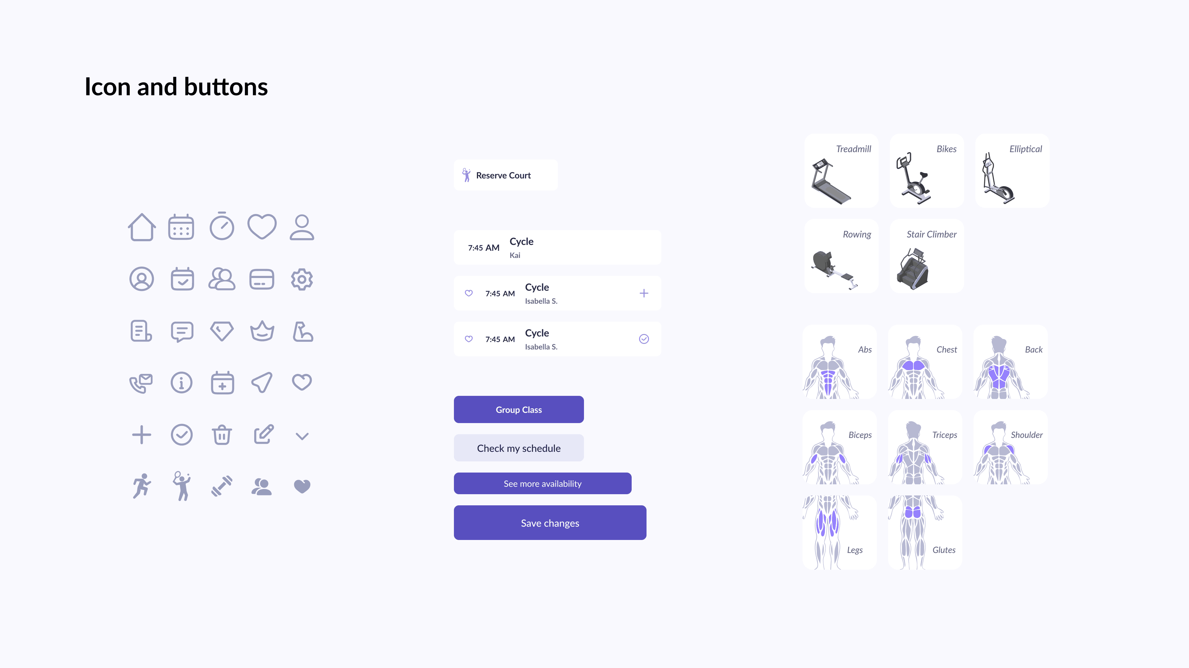
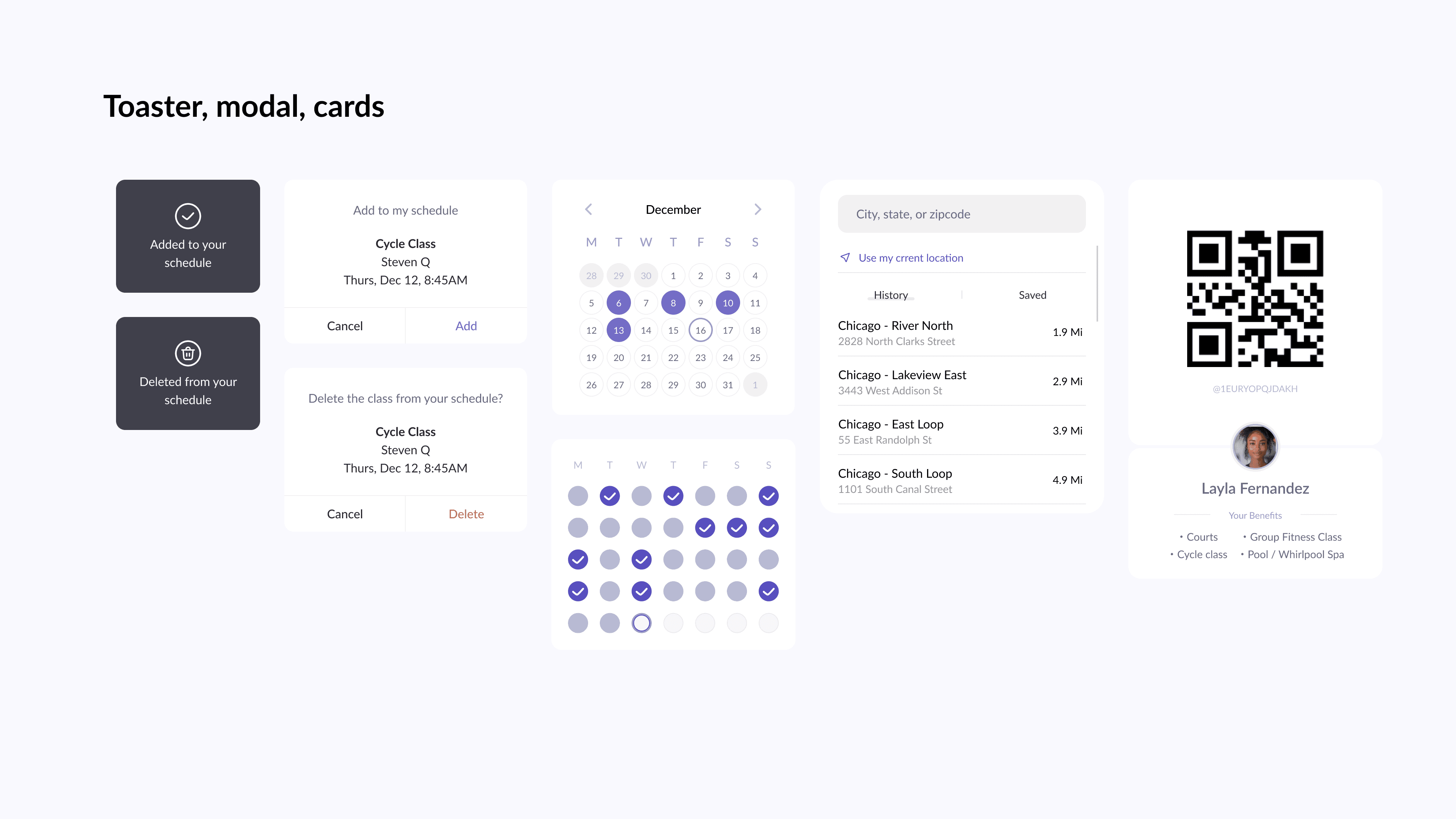
Style Guide & Component Library
Reflection
This project has been a rewarding journey to practice my skills with figma components, variables, and design system.
Testing ideas with mid-fidelity wireframes to streamline decision making process, ensuring getting feedback at early stage
Using variables and components, as a part of design system, speeds up the design process significantly. It enables flexibility in testing different idea while maintaining design coherence


