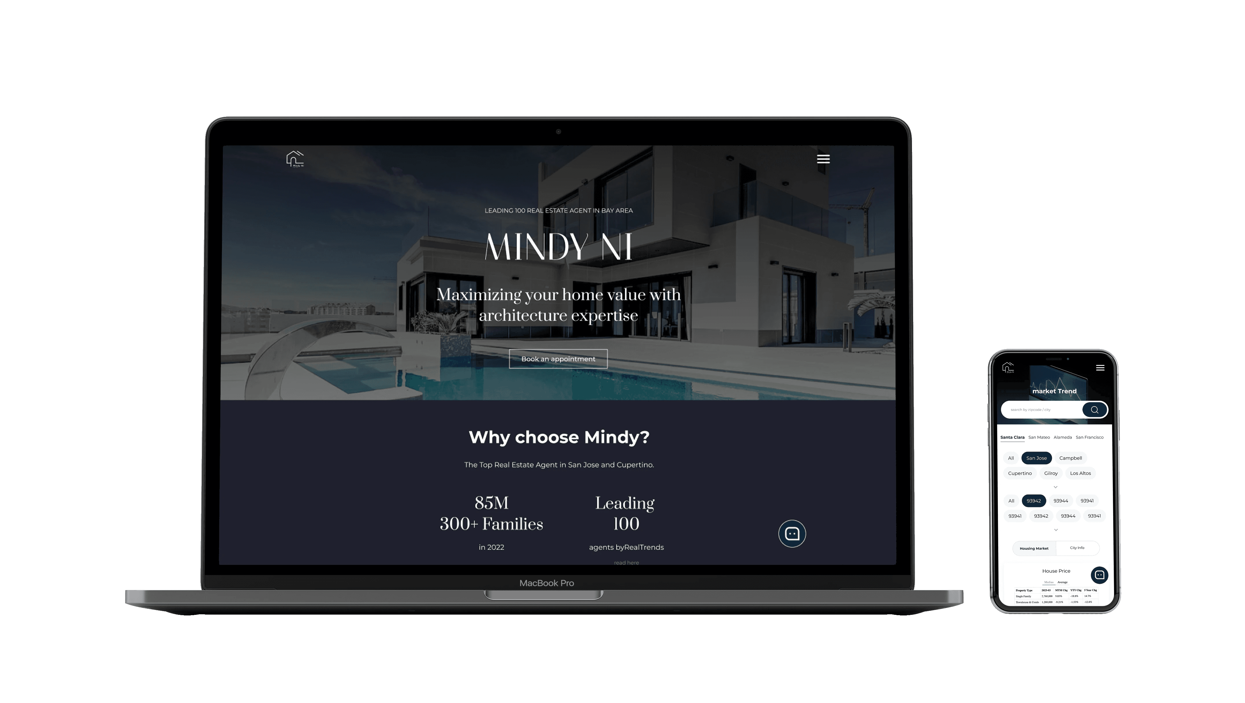
Web
Revamp
Improve the professional online presence of a realtor and streamline the lead screening process
RESPONSIVE DESIGN
HAND OFF
CLIENT COMMUNICATION
UX/UI Design
2023, 4 Weeks
Figma
Midjourney
Zoom
Client
Just Quinn
Context
With the thriving housing market, my client has experienced an increase in customer volume. She is seeking a redesign of her current website.
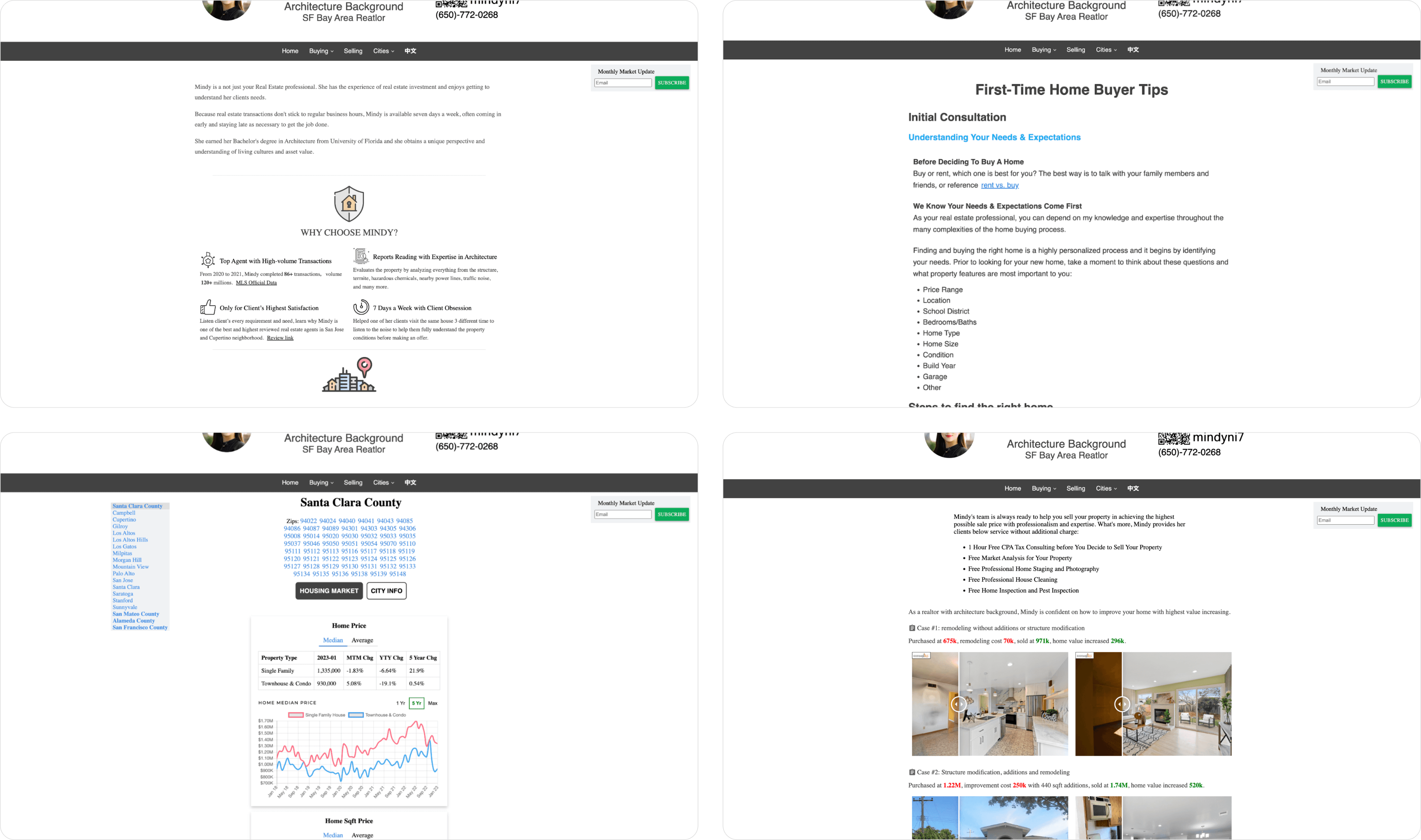
what the website looked like before
Identify Client's Need
The client didn't really have a clear vision at first — and it's my job to help them figure that out. So, in our first meeting, I came up with some questions to get a better grasp of what they wanted and to outline the scope of our project.
Who is your current audience?
· Mostly first time home buyers in Bay Area
Who is your target audience?
· Individuals with more stable financial situation, looking to upgrade their homes, prioritizing spaciousness, high end housing choice
· Individuals who want to invest in the housing market and cares about return of investment
What do you want to achieve through this redesign?
· Filter leads received from website by topics. Wants to know if the lead is about to buy, sell, swap or manage property
· Reduce random inquiry calls at inconvenient times
· Attract potential clients from the target group
With clarification, I mapped out some key elements based on her needs and industry standard.
Lead Filtering
a usable, functional "Contact Me" design pattern to filter leads
Data
strong data, testimonials, and a compelling bio — a persuasive online presence that converts
Market Trend Tool
Emphasize the existed market analysis tool for professional image
Standard / Existing elements
Listings and sold homes
Service provided
Blogs and insights
In essence:
Redesign the website to more effectively target the client's customer segmentation, streamline lead screening, and enhance the overall professional image.
Wireframe
Having observed that over 70% of her current website viewers are using mobile devices, I started with the mobile design.
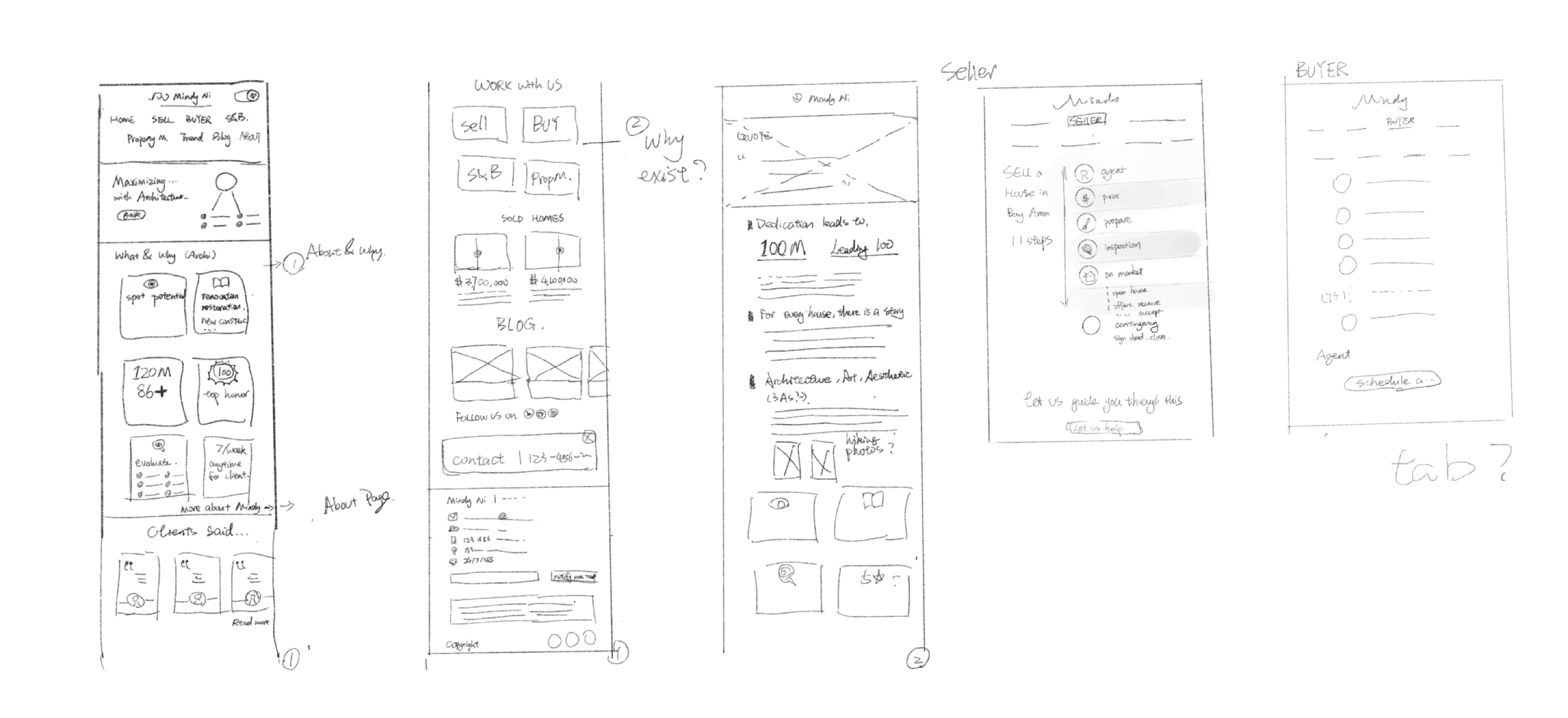
Sketch of the first draft
Once key elements were established, I created an initial draft for feedback prior to developing the wireframe.
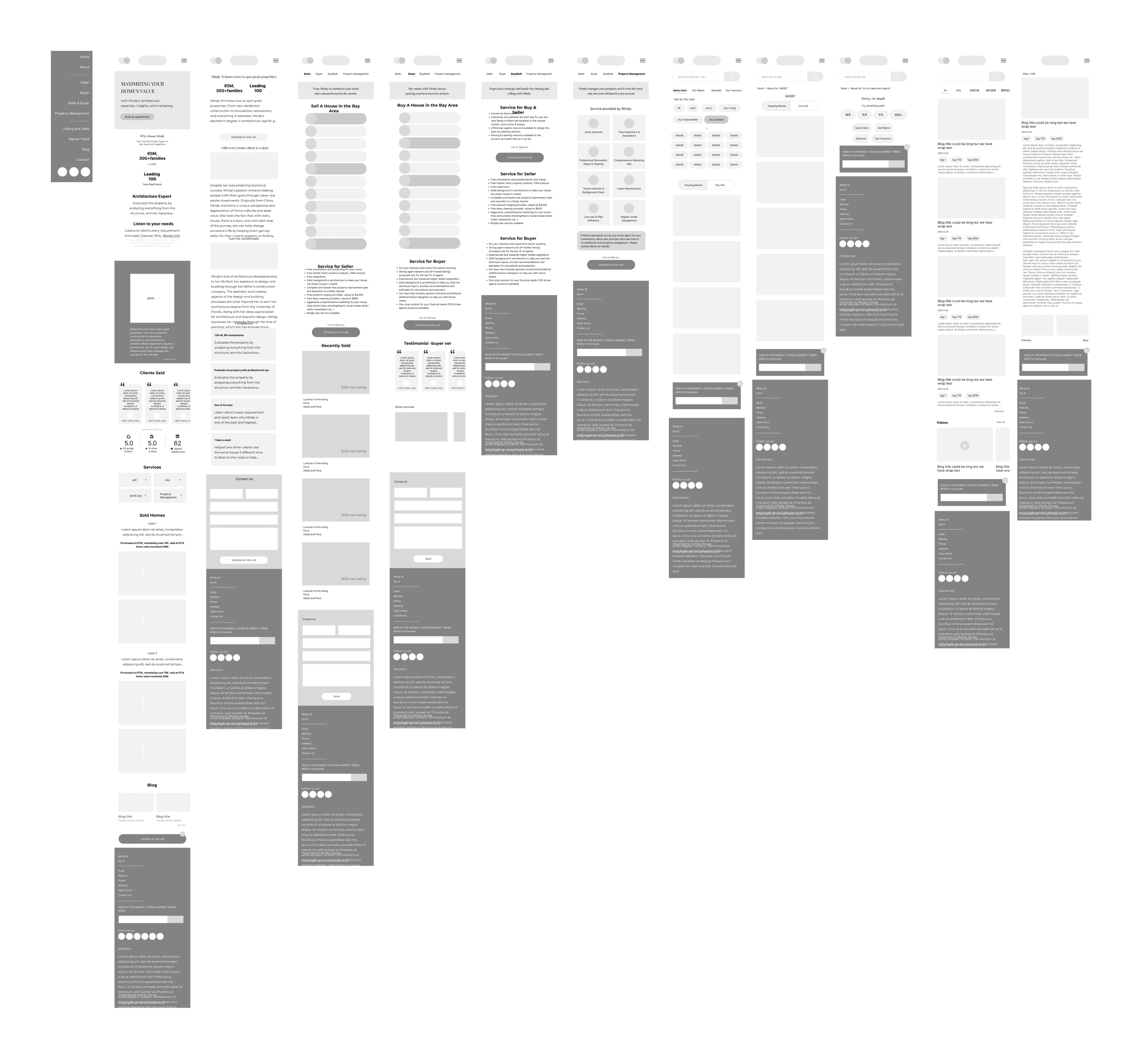
Low-fidelity wireframe
Visual Style
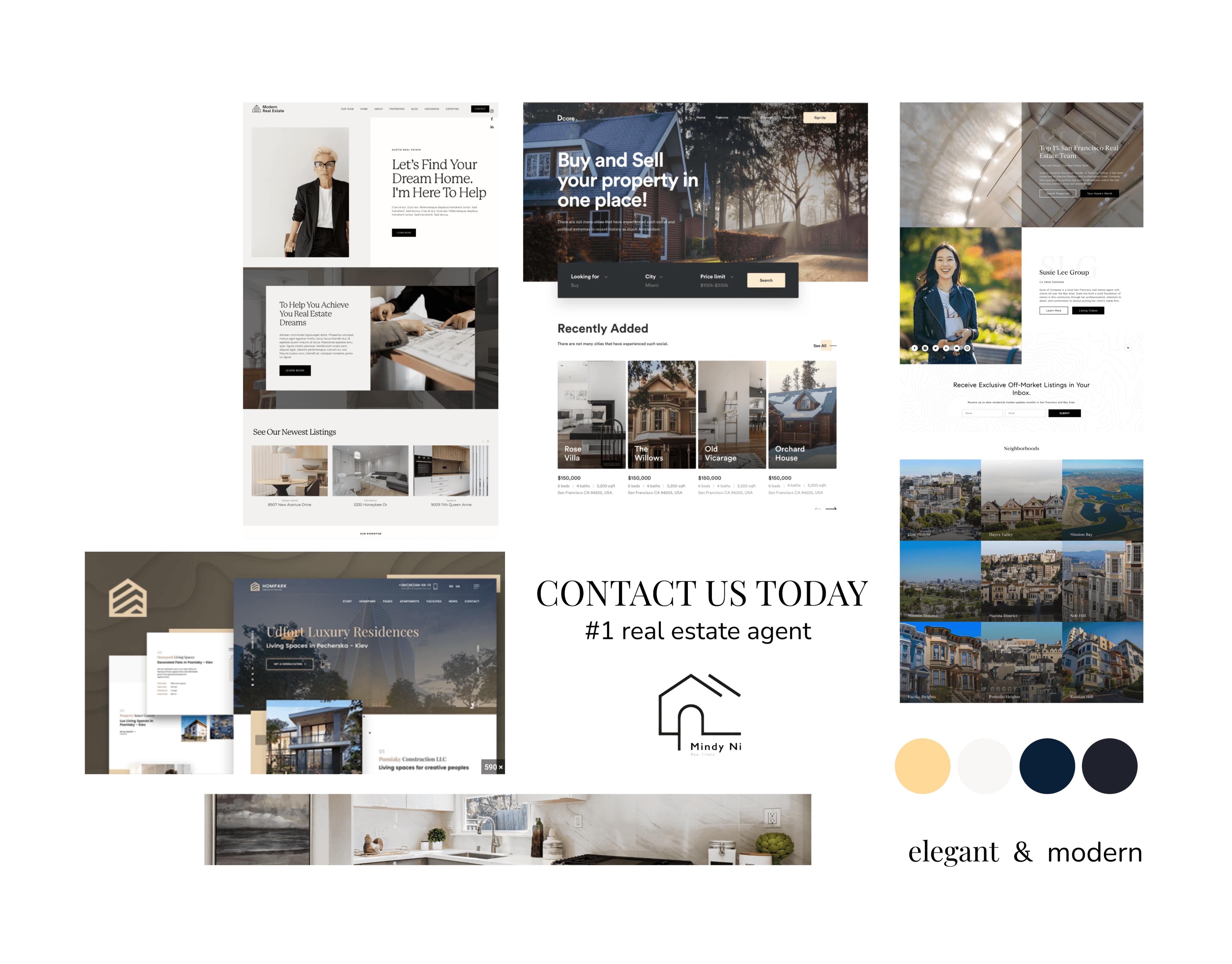
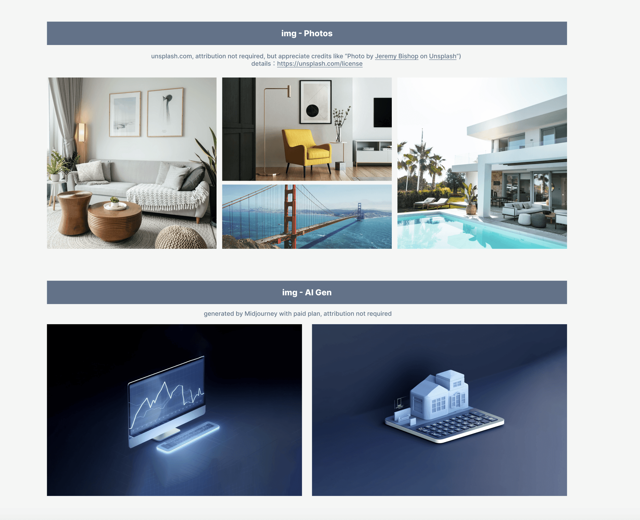
The moodboard settled
Three Highlighted Features

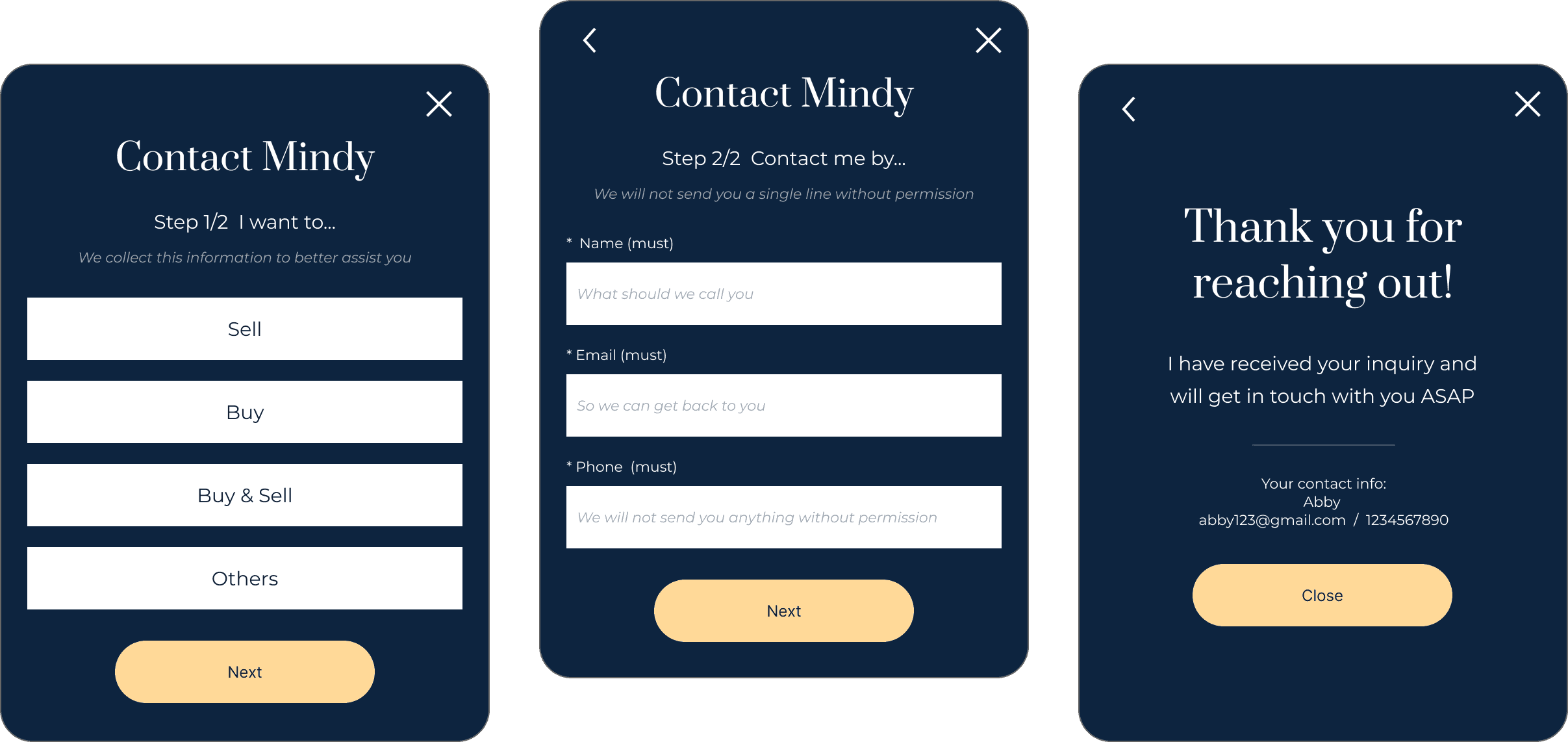
To enhance the visibility of contact us, I implemented a floating action button (FAB) positioned in the bottom right corner of all pages, within the thumb zone.
Additionally, I have ensured that the filter questions are presented at the beginning of the process, allowing my client to schedule a call based on the data collected, rather than receiving random calls.
Encouraging individuals to complete forms can be challenging, and potential leads may disengage at this stage. To minimize friction, I implemented a few enhancements:
-A stepper for increased clarity: it just takes two steps.
-Concise messaging to assure users about data privacy (as is appropriate).
Numbers
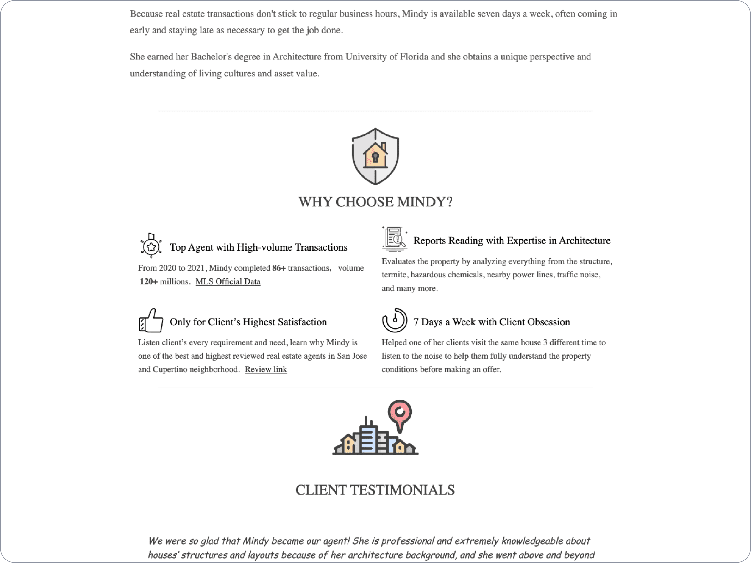
The client demonstrates an impressive performance regarding her business track record and academic background; however, this information was somewhat obscured within lengthy text.
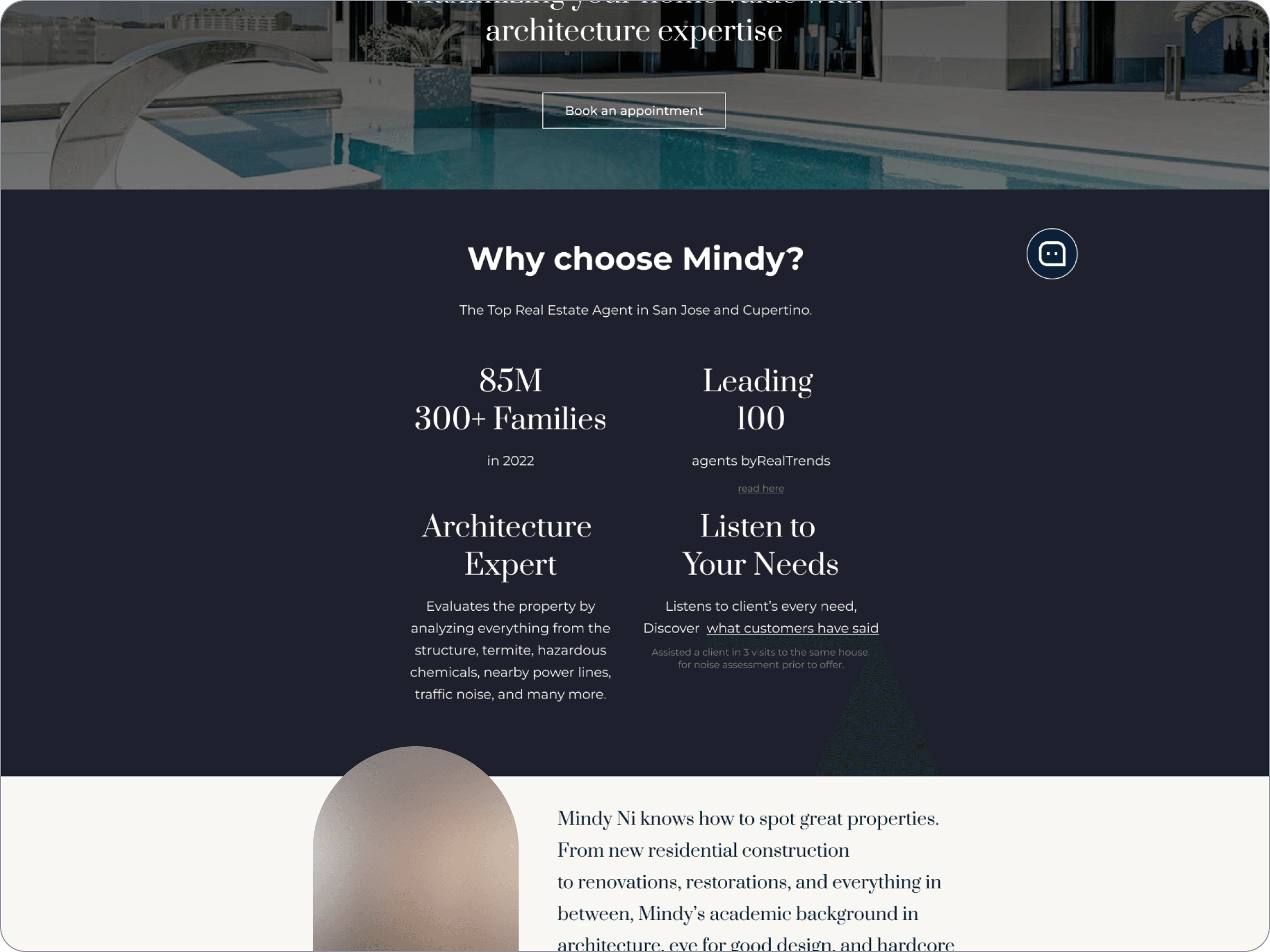
I extracted four key metrics and facts to enhance the impression section, highlighting her strengths effectively.
before
after
🧠 According to Miller's Law, the average individual can retain 5±2 items in working memory.
So, it is easier to make a strong impression with just 4 key words
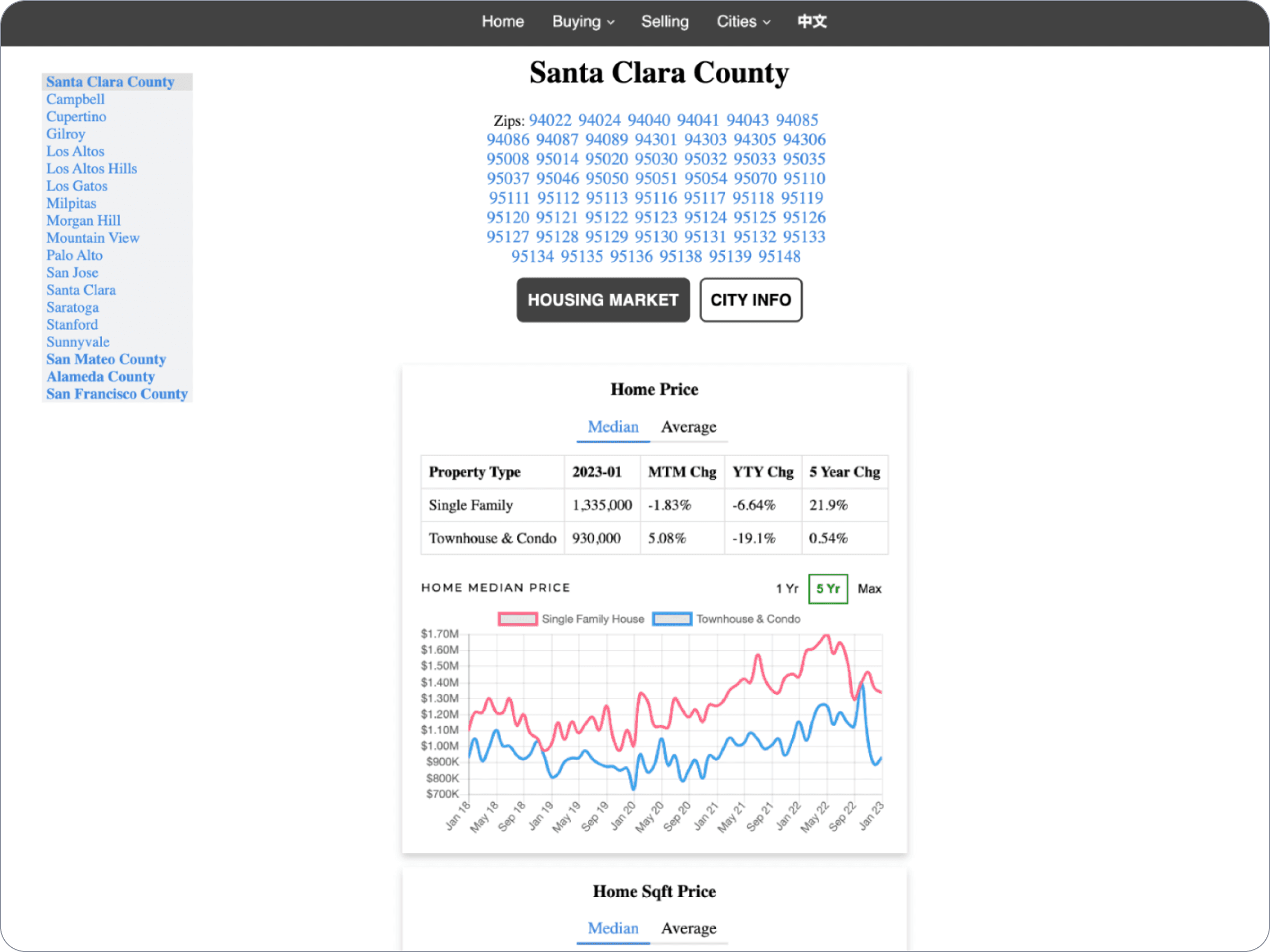
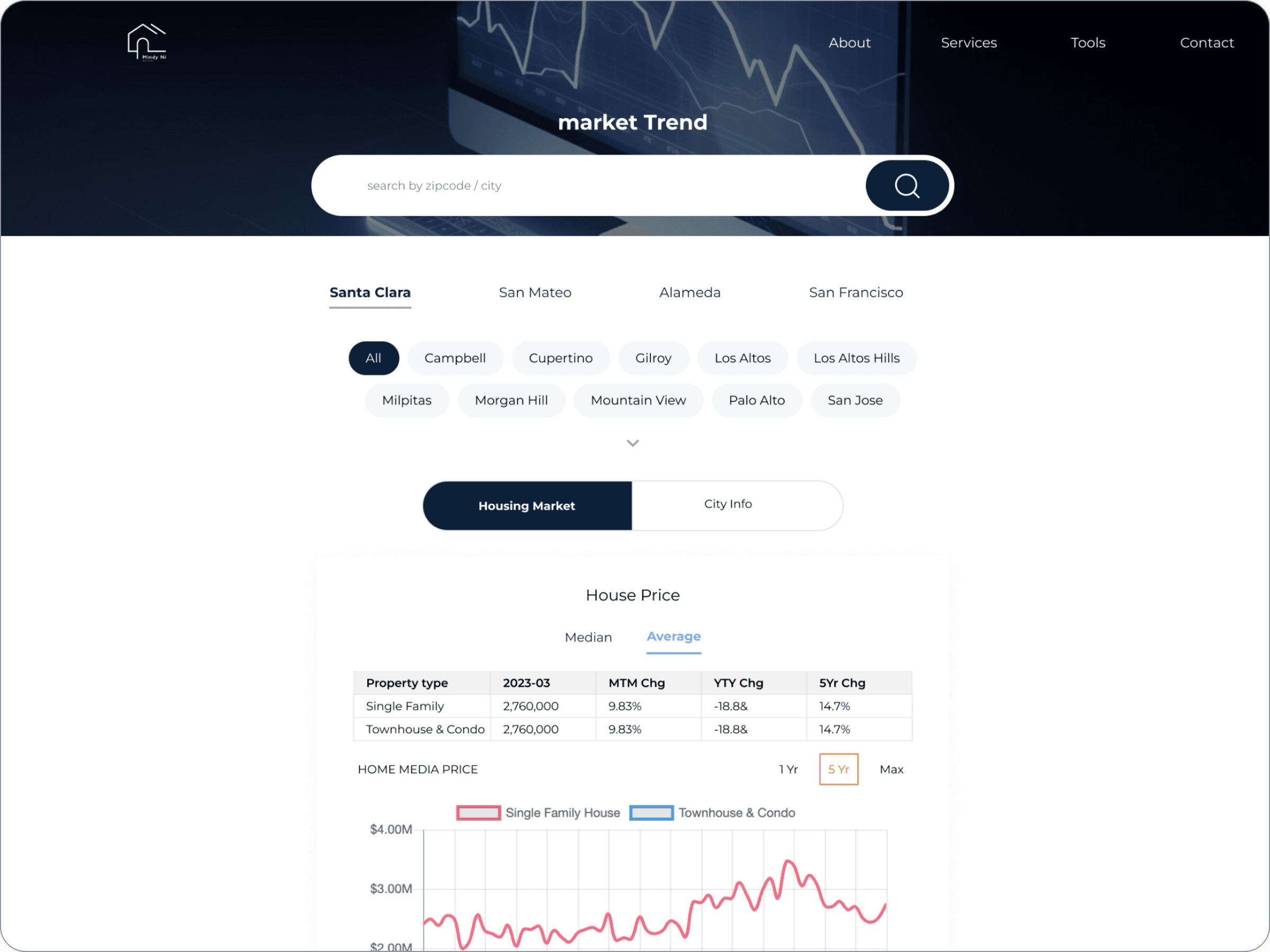
My client regarded data and reports as a critical component of her offering; however, when coupled with usability issues, their effectiveness diminishes.
Before
After
The current tool presents a challenge due to its cumbersome interface, which is filled with detailed information and extensive plain text, making it difficult to clearly discern the purpose of the chart.
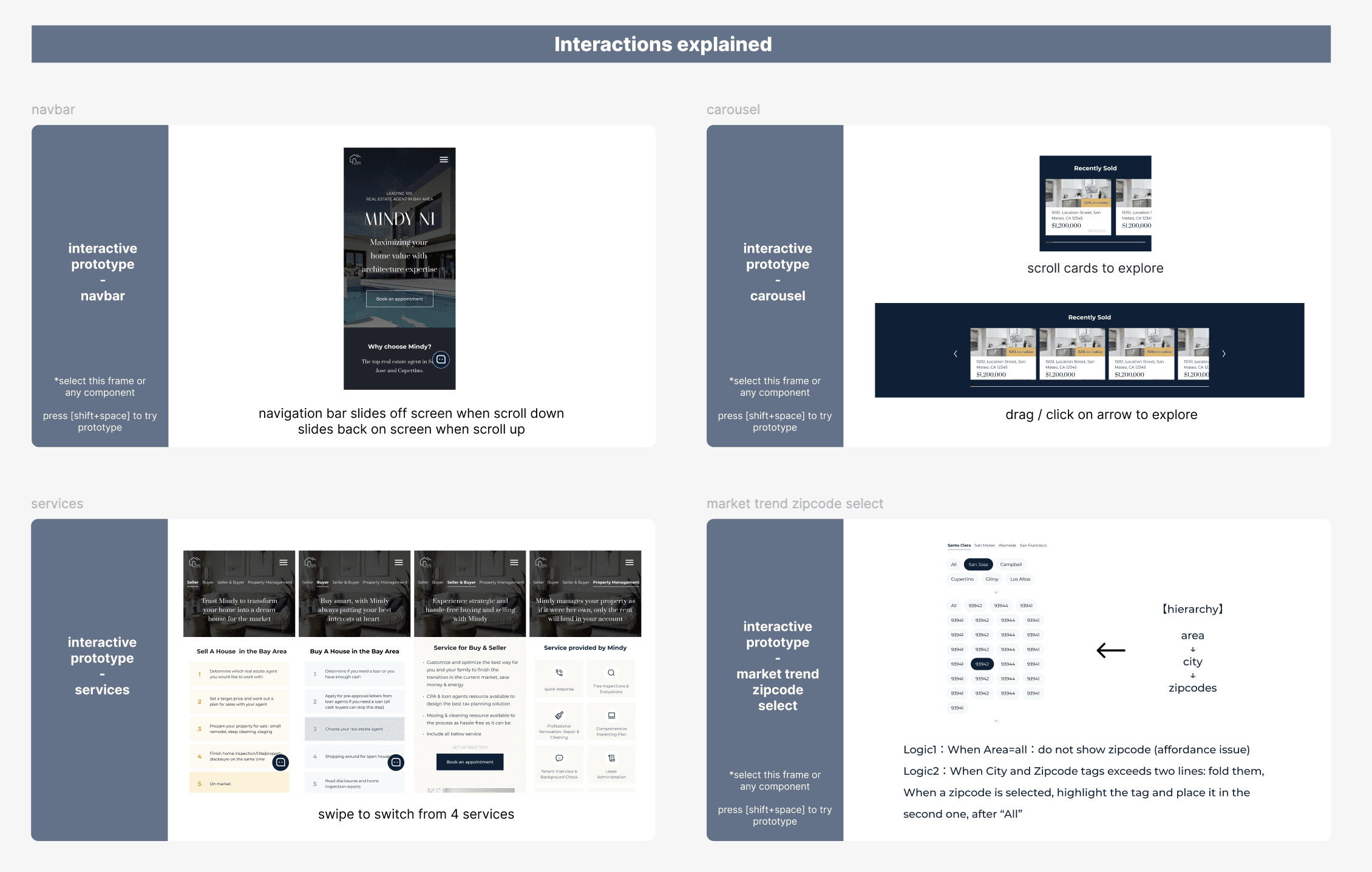
To enhance the clarity of the data presentation, I reorganized the navigation into three tiers:
county / city / zip code
This arrangement follows a logical order and highlights selected options to indicate the current location.

demo of how different control layers work
In regard to edge cases, an outlier such as San Jose, which contains 57 zip codes within the city, necessitates a more fundamental modification of this database.
Additionally, I have included a search bar as a potential feature for future development.
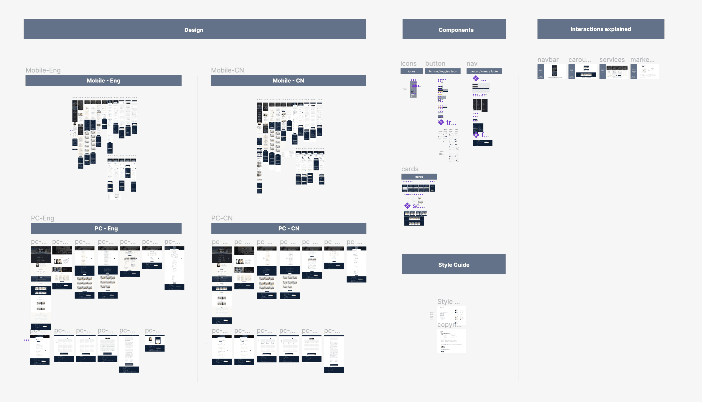
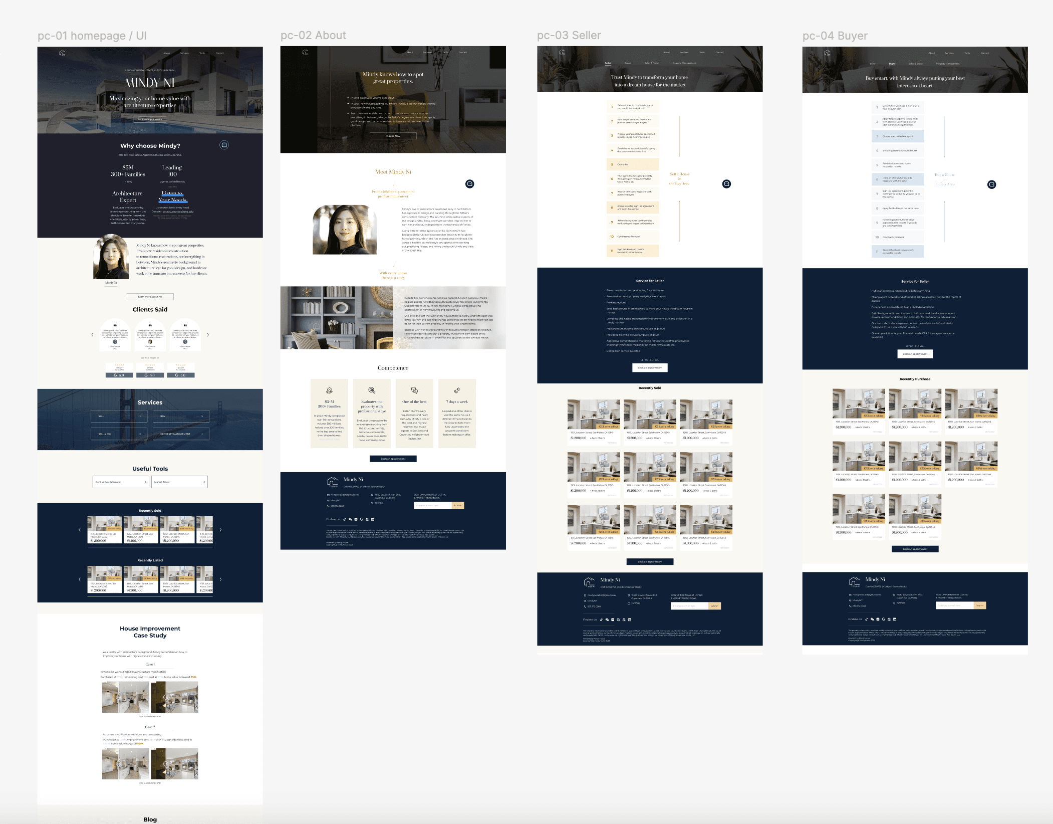
High-Fidelity
scroll to explore homepage
Hand Off
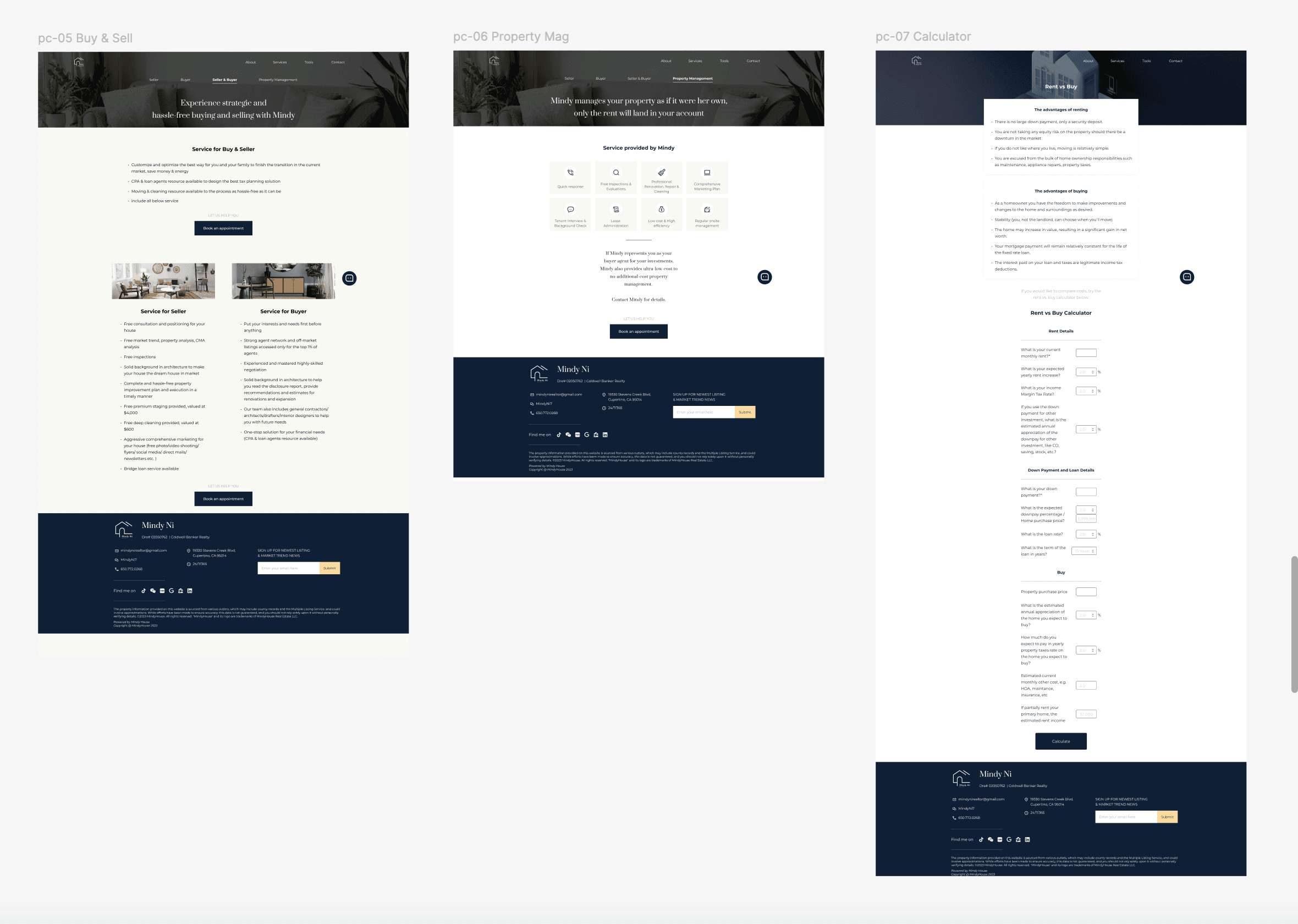
The project has been transferred to the client for development.
Reflection
Maintaining alignment with clients throughout the project was essential for its successful delivery.
I outlined initial ideas and got feedback early in the process, keeping everyone informed about potential changes, such as layout and style, while proactively gathering input throughout the journey. This approach resulted in minimal revisions and satisfied clients

