Rice App
From 0 to 1, orchestrated a restaurant deal & coupon app partnered with over 100 small business owners in California
0 TO 1
USER RESEARCH
PRODUCT DESIGN
DECISION MAKING
My role
Sole
Product Designer
Timeline
2019-2020
Tools
Figma
Sketch
Asana
Miro
Zoom
Scope
Chihuo.Inc
Team
Zoe Zu - PM
Qingyuan Wen - Engineer
Ping Wang - Engineer
Xintao She - COO
*the app was initially in Chinese, I redesigned the english version for this case study
In a nutshell
In a 5-month timeframe, I worked within a team of 5 to design and launch a mobile platform, offering users exclusive restaurant coupons and deals in California.
My contribution
Oversaw the entire design process from start to finish, starting from the initial draft and leading up to the final product launch.
Result
10k+
New user
in 8 months
4500+
Recurring
paid users
100+
Restaurant partnerships
21,000+
Redemptions
over time
Context
Pinpoint the problem
As the business grows, a major issue has emerged :
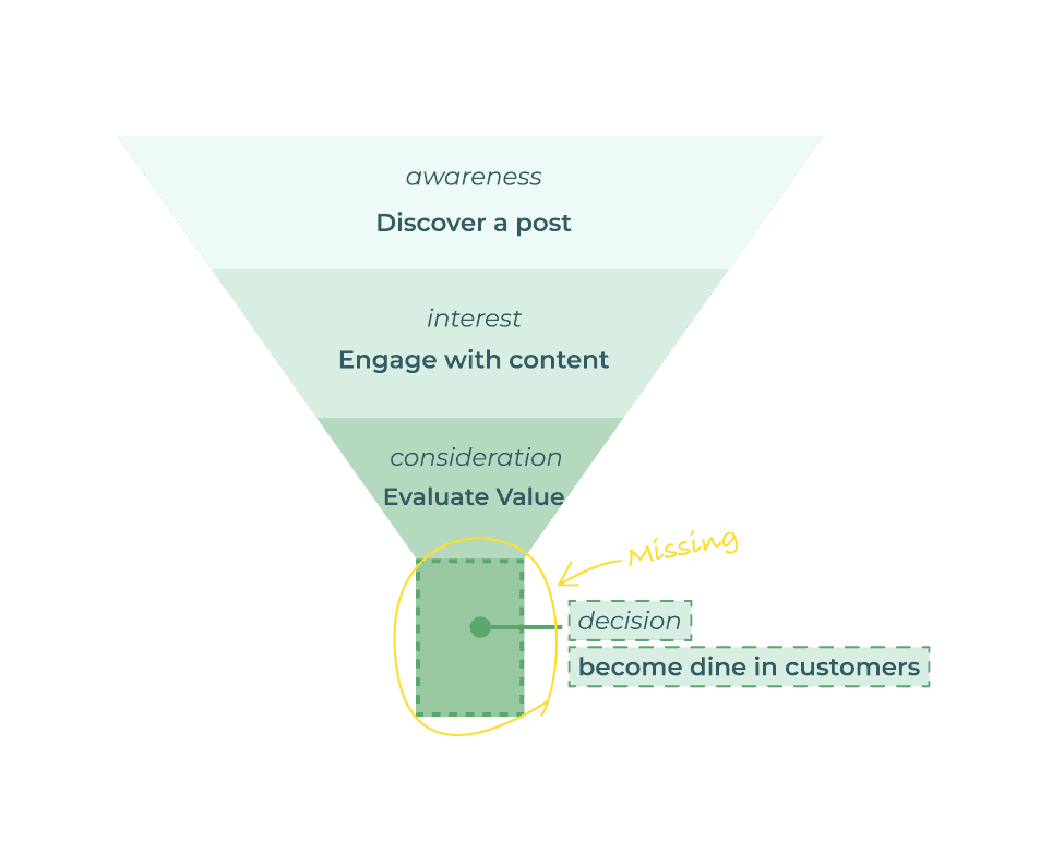
We don't know the conversion rate.
Paid marketing campaigns are one of CHIHUO's primary revenue streams.
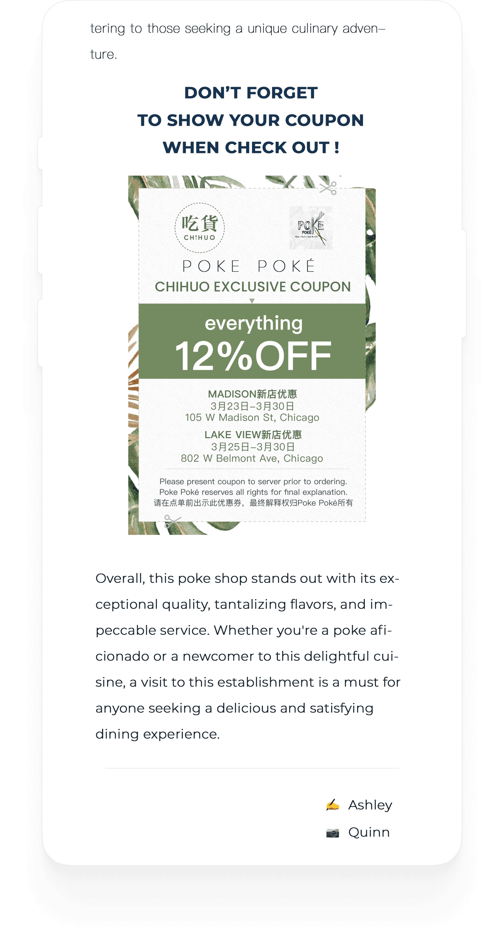
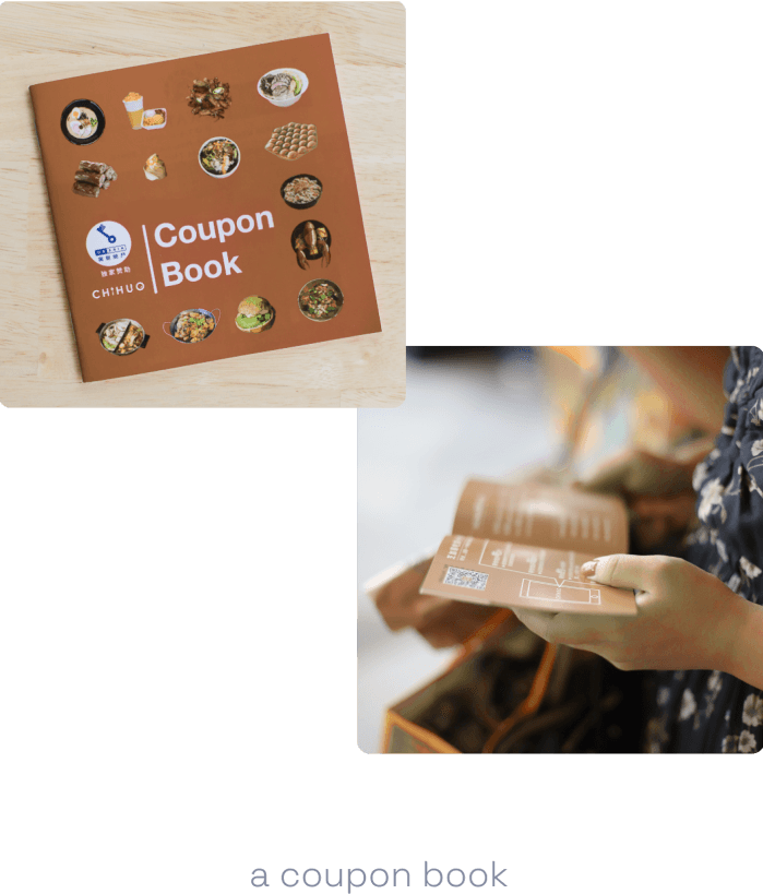
Due to the cumbersome redemption process — screenshotting, saving, and showing it at the restaurant — we can't track how many subscribers actually use the coupons when dining out.
These campaigns often use coupons as a hook in sponsored content, a proven marketing strategy that boosts user engagement. Our backend data shows that posts with coupons consistently outperform others.
Meanwhile,this serves as a key metric for our sales team to effectively showcase our value proposition to our clients.
How did our clients feel about it? And did the tiresome process of saving some pennies bother our subscriber? We interviewed 8 clients and 20 subscribers to gather feedback:
6/8 Clients:
"I'd like to work with a company offering solid coupon campaign conversion rate."
14/20 subscribers:
"I constantly forgot about the coupon in my camera roll, even I did go to the restaurant"
So How Might We
track current conversion rate?
encourage subscribers to use coupons more often?
generate potential additional revenue?
Ta-da, The Goal Trinity
With three HMW bearing in mind, we started to brainstorming:
Would there be a product that ensures benefits for all stakeholders involved?
The trinity
It is not easy, but we have to find a middle ground to make clients satisfied, to be in the best interest of subscribers, and not to burn a ton of cash — a dilemma that most start-up company might face sooner or later.
From User Needs to Design Principles
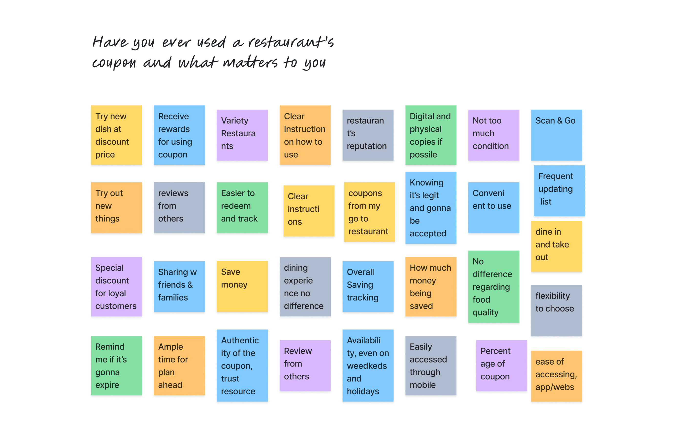
We want to know our subscribers better, dig out their needs and behavior pattern in their dining experience. We invited a group of volunteers, asked them:
Have you ever used a restaurant coupon, and what matters to you the most?
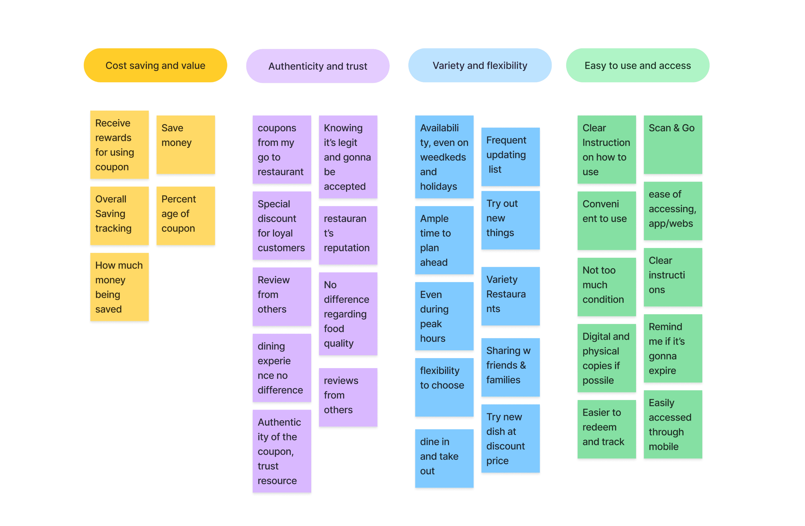
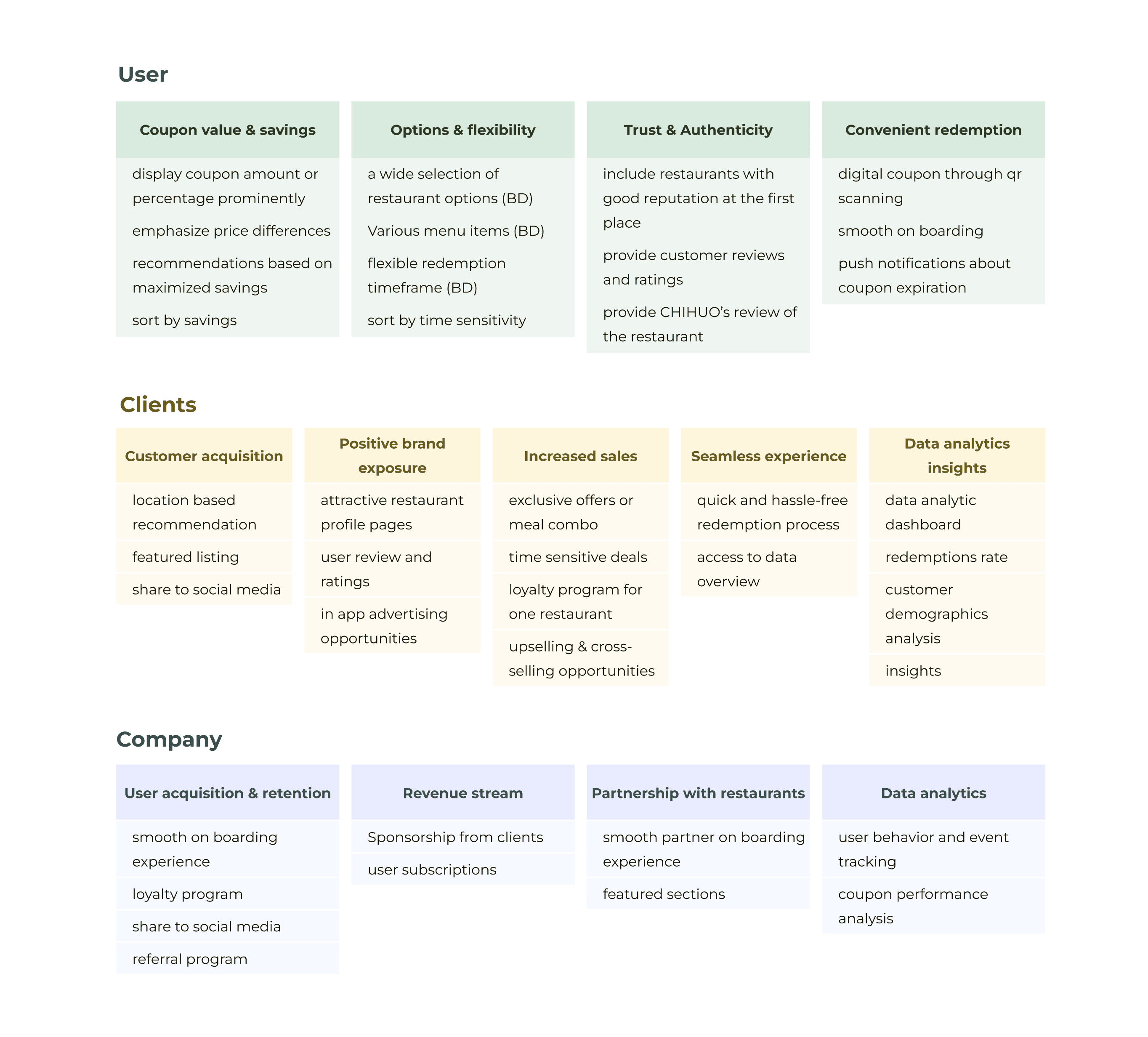
After affinity diagramming, I sorted insights into 4 categories for a better grasp on the most impactful elements.
Key design principles
These continued to be our key design principles for future design iterations.
Evaluate and Eliminate Design Solutions
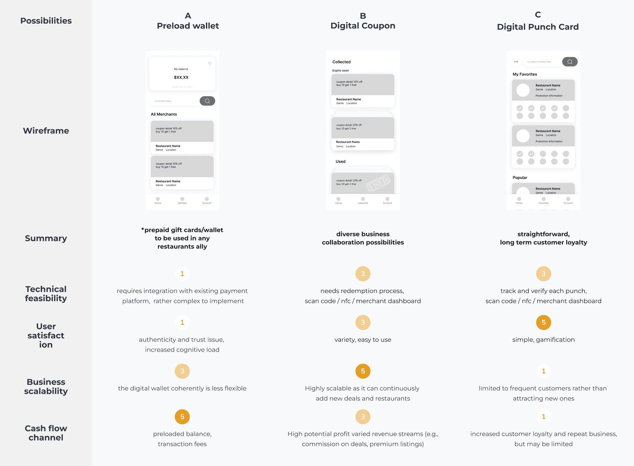
With these insights in hand, the team began placing in possible solutions on the table. We finally boiled them down to 3 solutions and rated them across 4 dimensions:
technical feasibility
user satisfaction
business scalability
cash flow
Each option was reviewed by these criterias and rated, higher the number, better the option.
"The first idea seemed a bit forward because our COO at the time saw its potential. However, after some discussion, we decided to pivot.
This may not be a holistic review, given our limited time and the lack of a data scientist to build a forecast model. But it was the quickest way to get everyone on board and move forward.
Ultimately, we proceeded with the digital coupon option.
After aligning with all team members, including our content creators, sales and marketing teams, we've made the decision to build:
a product that has a seamless restaurant coupon experience, while providing visibility to marketing campaign performance.
We are confident that this blueprint aligns with the 4 HMWs
track current conversion rate?
By collecting numbers on coupon usage
encourage subscribers to use coupons more often?
By providing a more seamless coupon redemption experience
generate potential additional revenue?
Commission fees, advertising, subscription, sponsorships etc.
Insights to Design Features
Now a clearer shape of what we are going to build was presented, I collected qualitative data from clients and company’s different stakeholders — the sales team, COO, and the founder. From where I started mapping out each insight to identify possible design features.
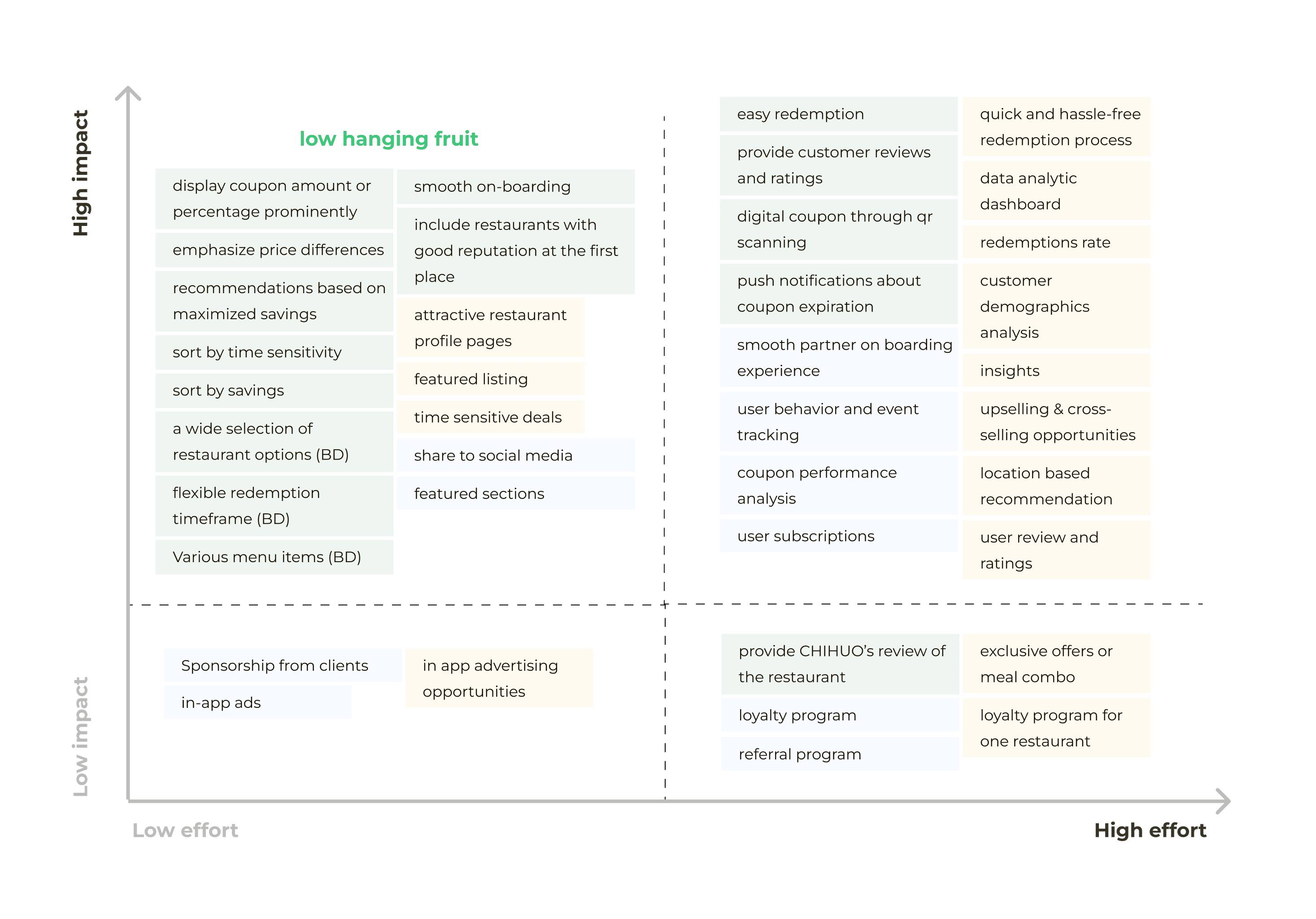
It is impossible to go through all the design features at the same time. So, I conducted a thorough analysis in which I identified all potential design features and then prioritized them based on the effort required for implementation and their overall impact.
With limited time and resources we had, it wasn't possible to meet all sides of expectations at once. So, we opted to tackle some easy wins—the low hanging fruit—and built our first MVP for testing.
Information Hierarchy and Wireframes
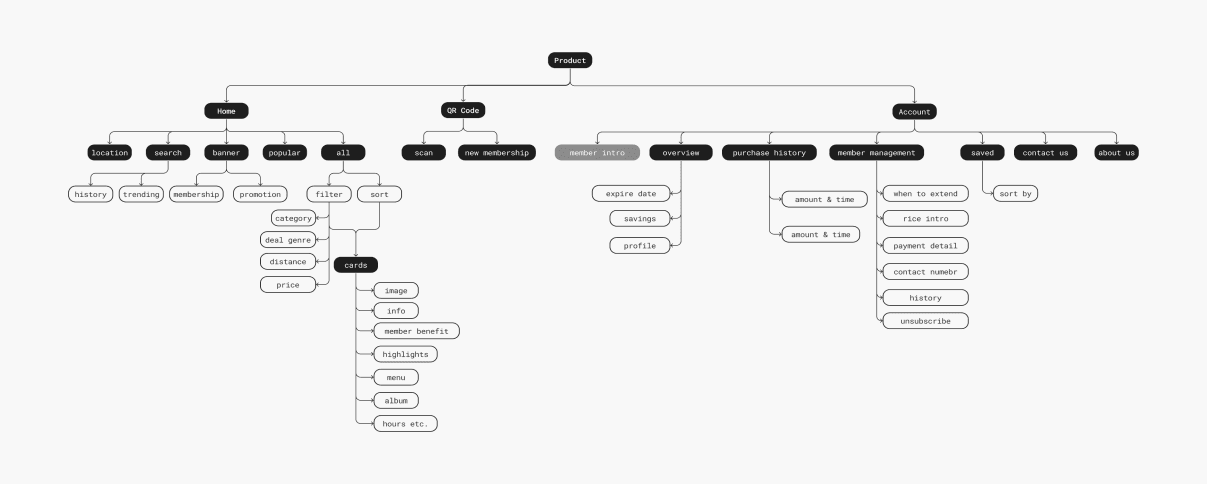
With the team's input, landscape audit on existing products—which surprisingly are not a lot, the information hierarchy and screen map were aligned by the team.
I then made 3 major user flows to test out the water and gather feedback internally.
From homepage to signup
Browse and search for a coupon
Account management and redeem a coupon
Iterations After Feedback
Countless iterations been done after presenting the wireframe to our internal team. Here, I'll highlight three major iterations that aligns with four key design principles.
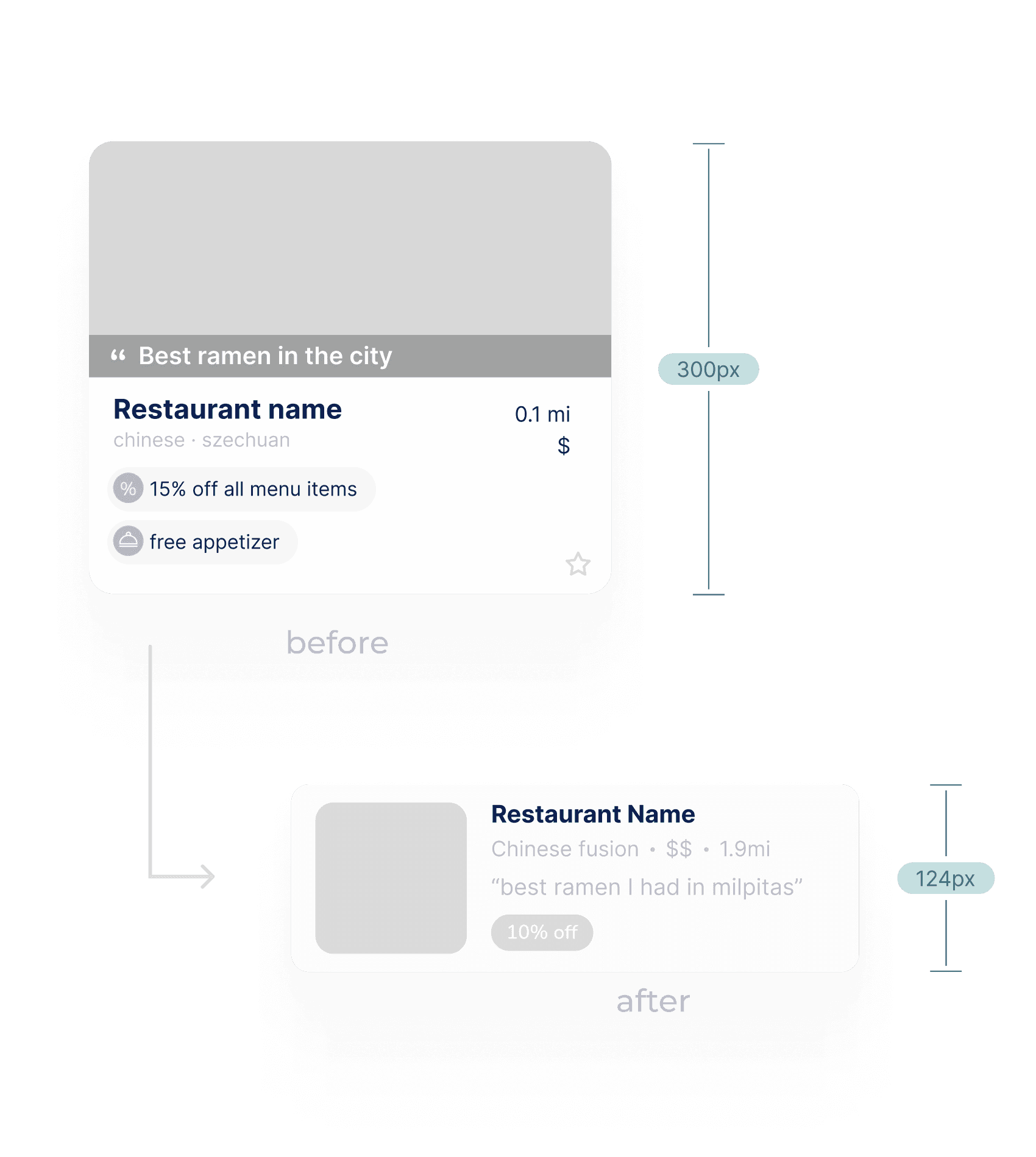
Increase information density
· Card view to list view
As our sales team settled more than 40 partnerships during internal testing, I change the homepage layout to fit more options in one screen.
· Added a filter to increase discoverability
Cost saving and value
Variety and discovery
Improve task success rate
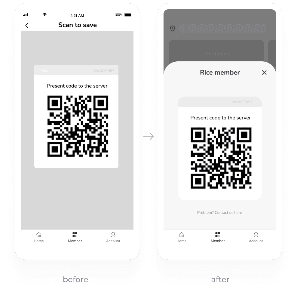
· Change QR code page to bottom sheet style for less interruption
· Direct access to customer support to build trust- thanks to the support from our sells team
Convenient redemption
Authenticity and trust
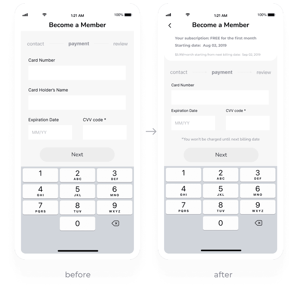
Provide more transparency
· Add subscription fee details at the top
· Add reassuring copy above CTA
Authenticity and trust
Prototype Walkthrough
1/6
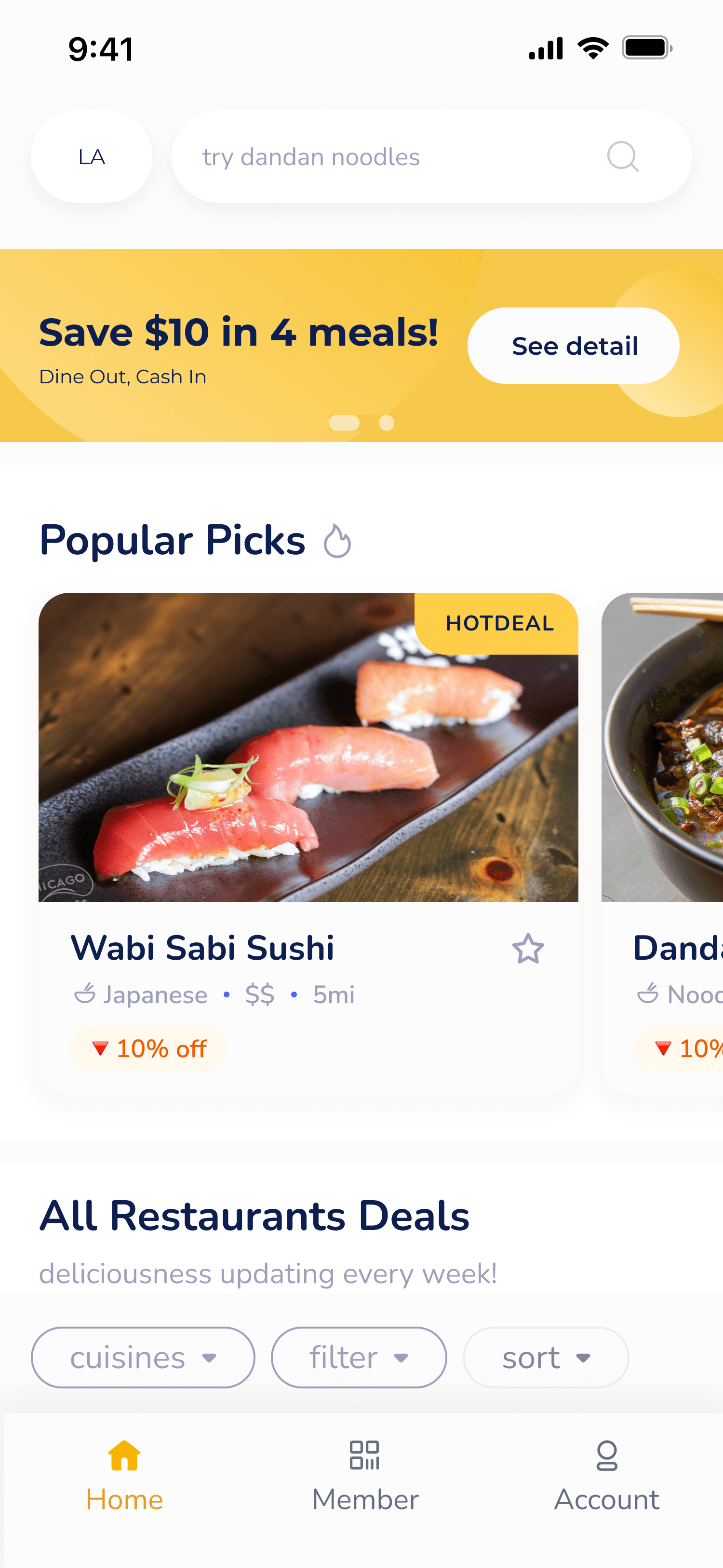
Home screen
where image comes first
A curated list at top for future operation potential
Maximize the potential of the company's digital assets by implementing an image-first layout
2/6
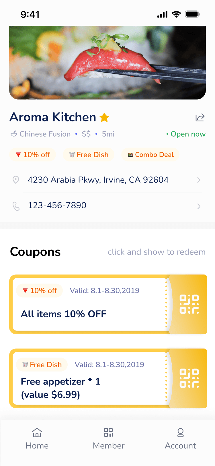
Restaurant page
all about serving the value
Enhance coupons with a skeuomorphic touch by incorporating gradients and shadows.
Utilize the loss aversion psychology by showcasing expired coupon to create a sense of missing out, of the opportunity to save money
3/6
The Redemption
accessible anytime
Redemption QR code can be accessed by tapping on the coupon or the navigation bar, ensuring it's availability
4/6
Filter
additional flexibility
With more restaurant partners joined us, even with the list layout, it still takes ≥8 scrolls to reach the bottom
Introducing a filter significantly improve the discoverability of our offerings
5/6
Search
visualize the hype
provides geographical context, supports decision-making and route planning
6/6
Membership
I'll get to that later.
Ensure that billing and cancellation information is clearly communicated throughout the process to address any concerns.
Style Guide & Component Library
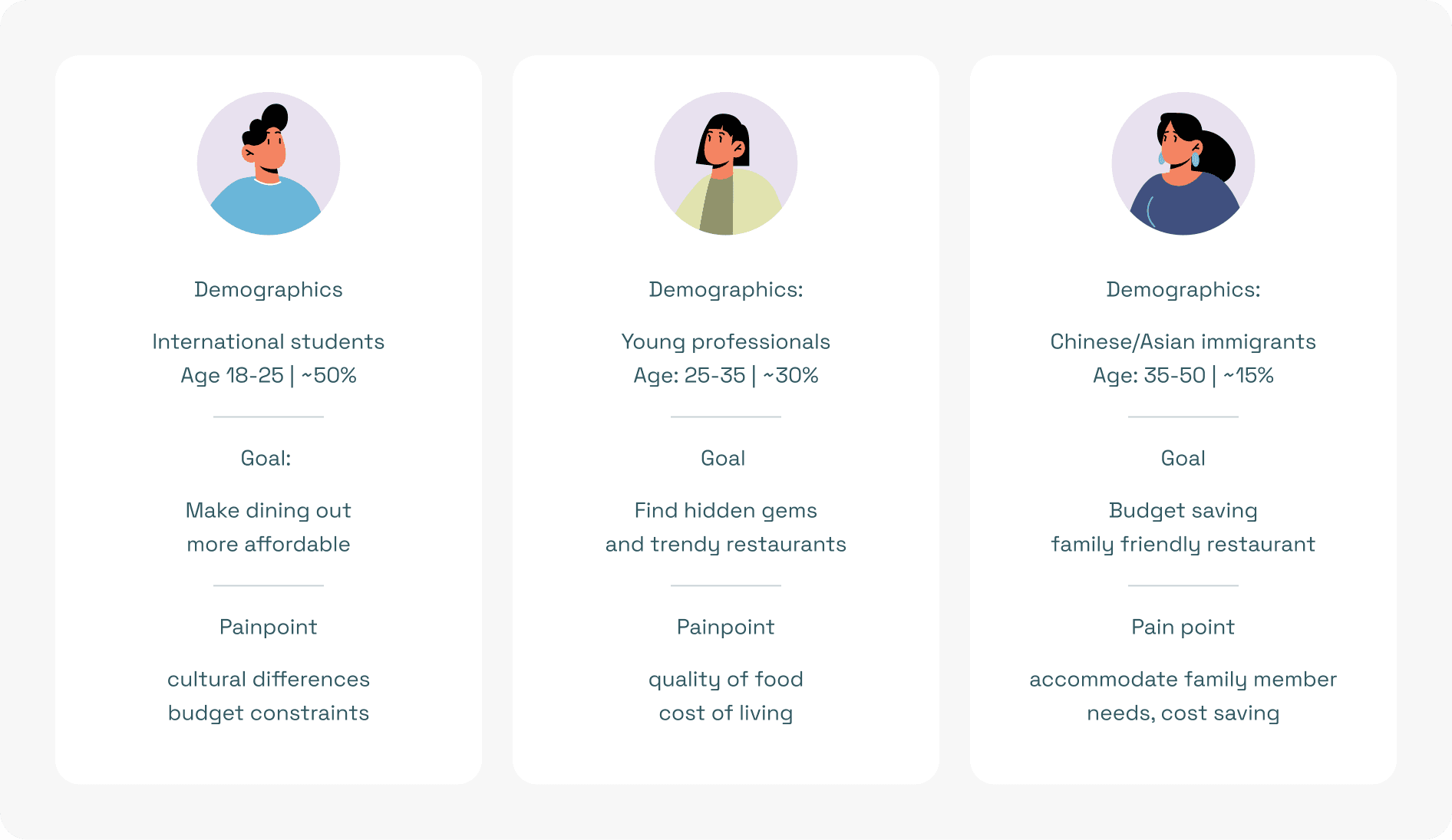
Based on the demographic data collected from our current follower base, I generalized some typical user personas as below:
illustration by @upklyak on Freepik
To sum up, the main demographic of our subscriber are:
· in their 20s -30s,
· usually students and young professionals navigating through their city life.
· care about food quality, are sensitive to prices, and are our most targeted audience.
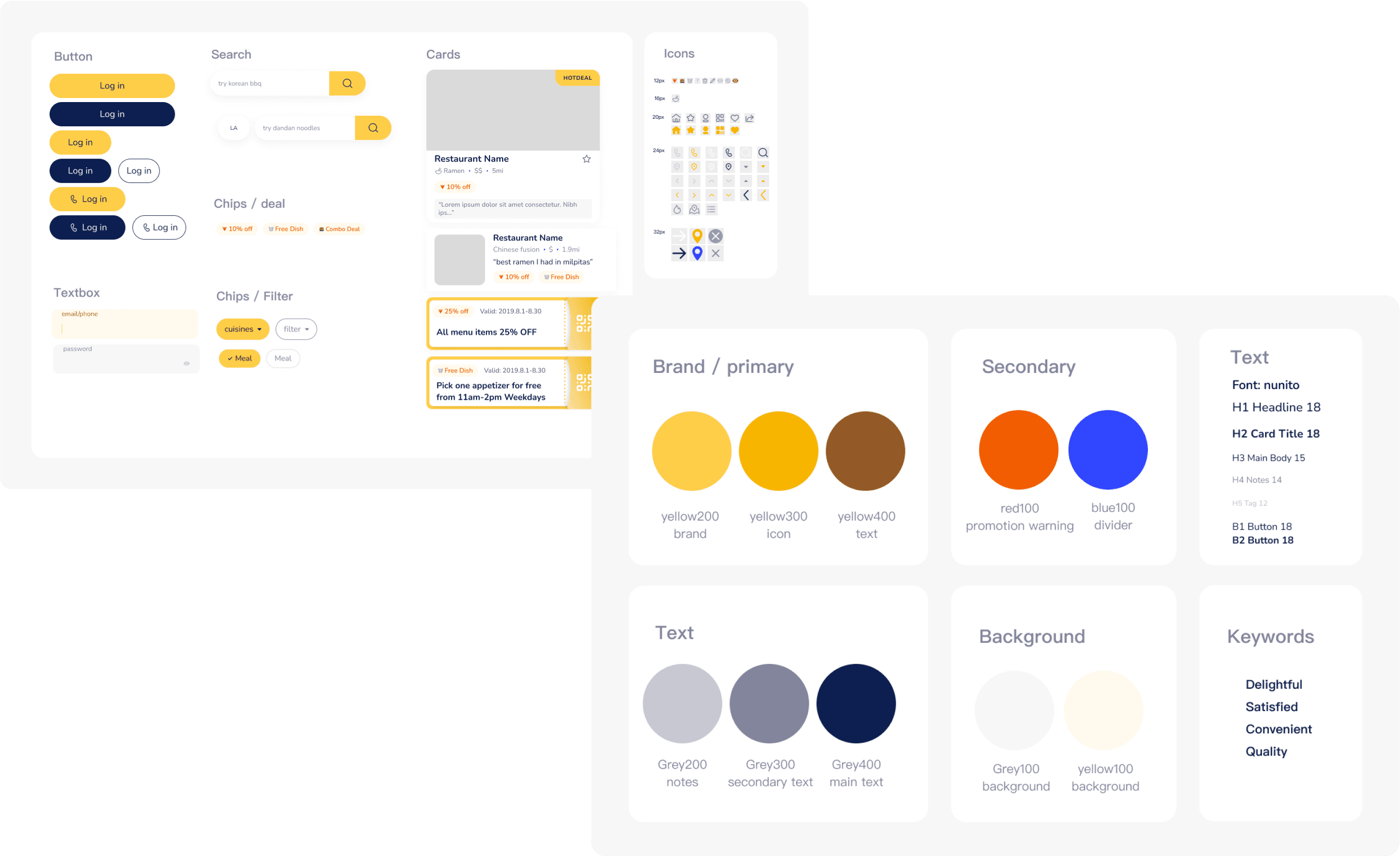
To fit their appetite, we want to emit a vibrant, happy and casual vibe. So I:
· defined the primary brand color yellow, evoking a sense of happiness and energy
· chose a sans-serif font with round ends, a little chubby but still modern
· designed cards with round corners, chips and buttons in capsule shape to match the chubbiness
component library
The Launch
The Launch and the Quick Setback
Our registered user base reached 2000 within two months, with over 100 partnered restaurants and brand collaborations like delivery apps, painting a promising picture.
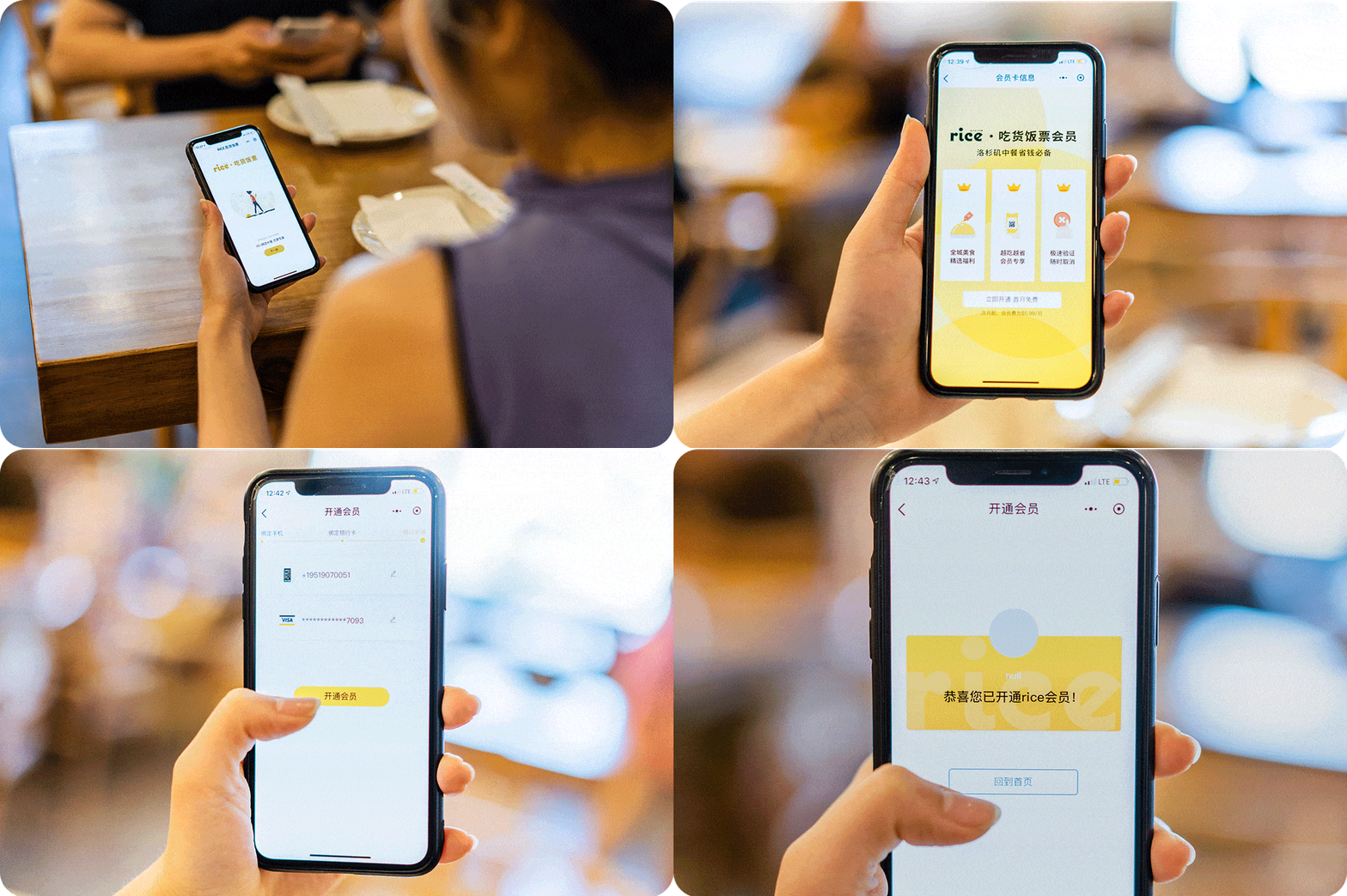
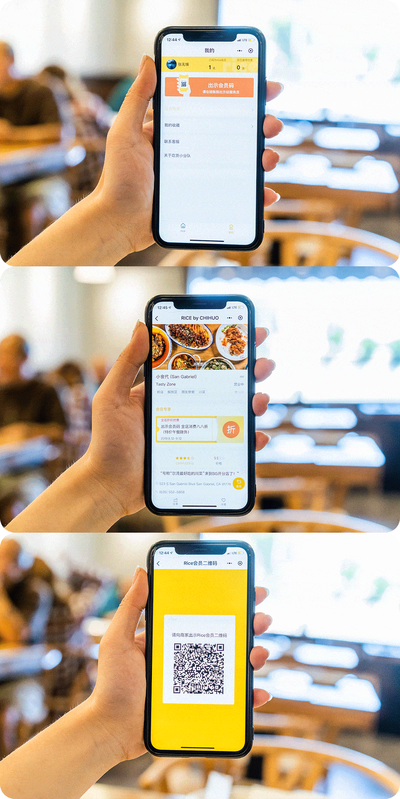
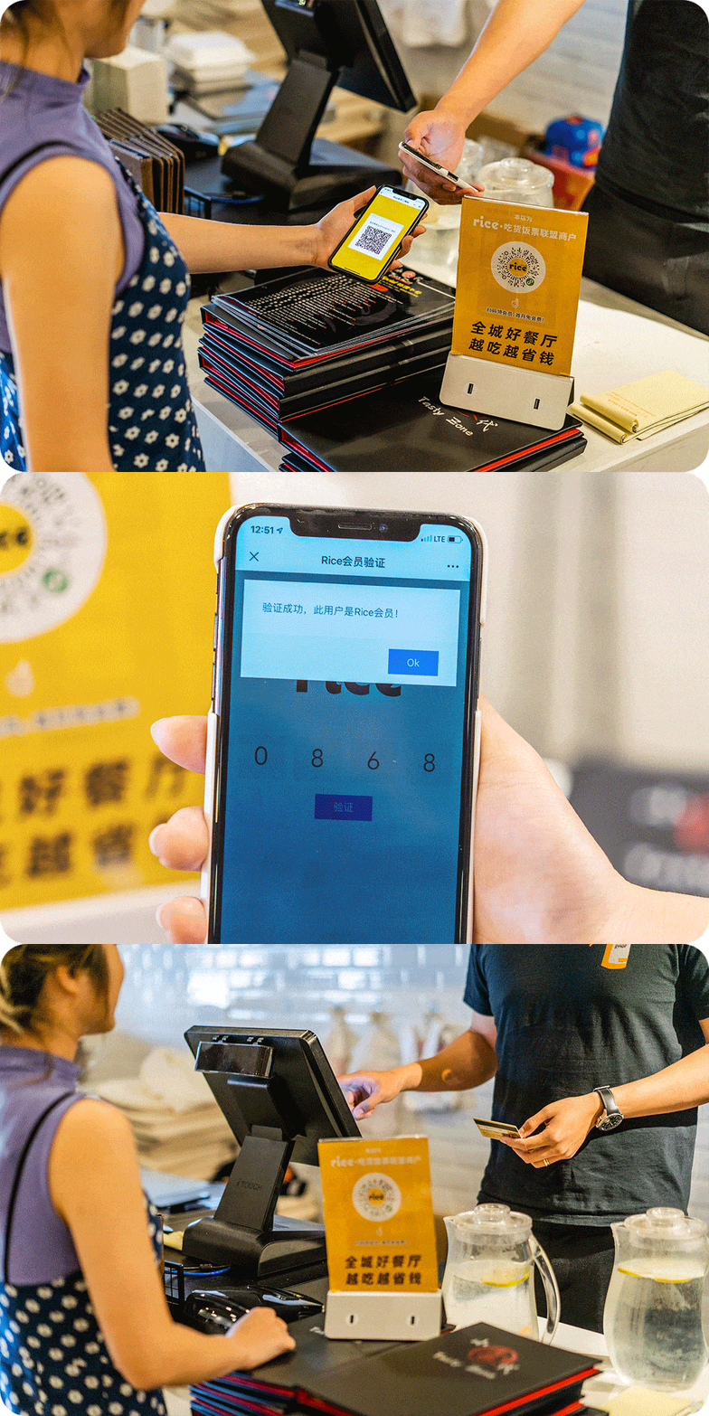
we filmed tutorials on how to use the platform
Now about the membership — yes, this is a subscription-based service due to management decision.
Consequently, an issue emerged:
We observed a low retention rate for paid memberships, particularly following the conclusion of the initial two-month free market entry campaign.
In alignment with the COO's vision at that point, we introduced a membership-only model to reinforce the product's exclusivity. That being said, to access our product, users need to subscribe for $5.99 per month.
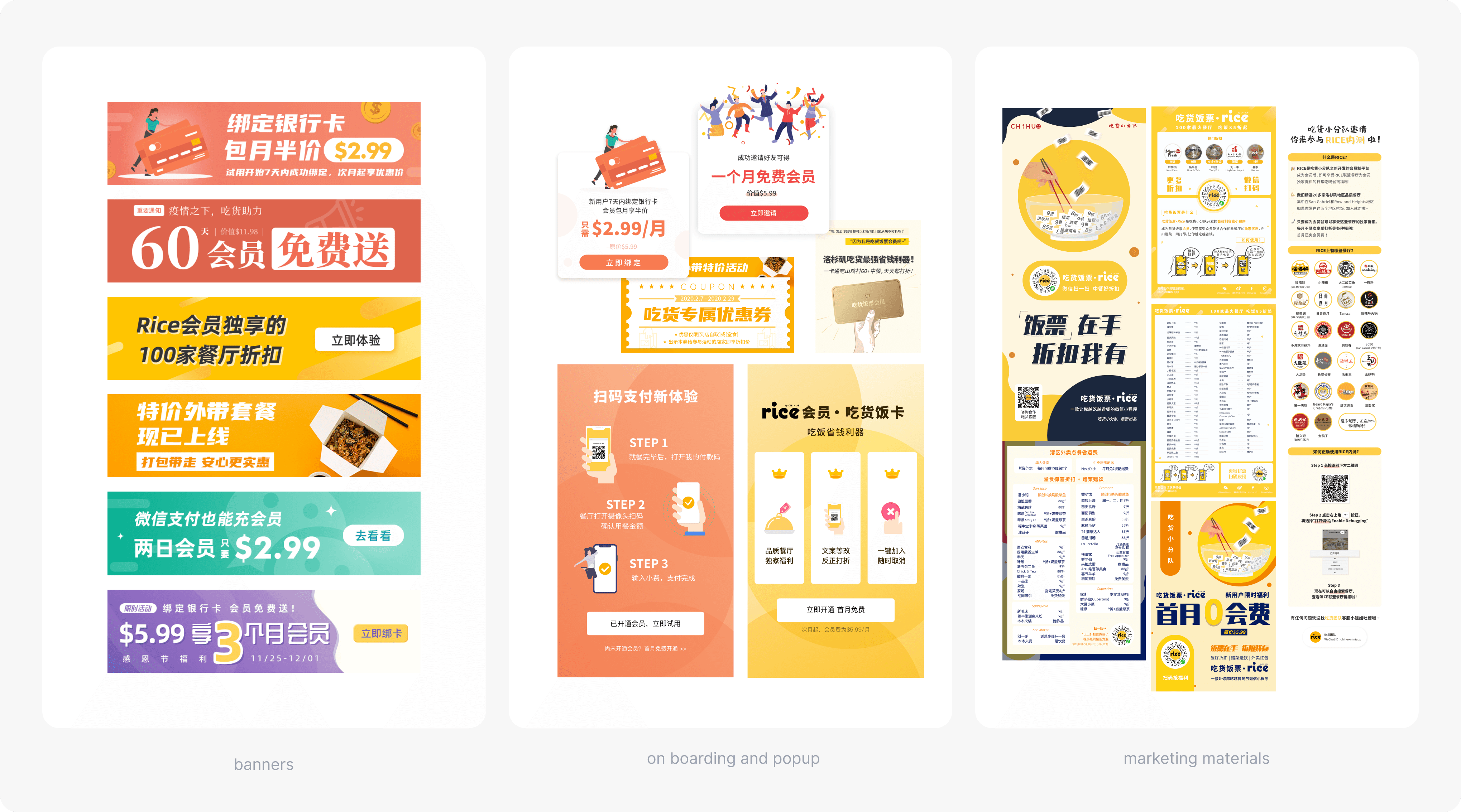
part of marketing materials I've designed for the launch
In light of this decision, I still have reservations about whether it was the optimal choice for a new product at the outset. Establishing trust takes time, and we faced challenges in retaining subscribers early on.
The sunset : (
At the beginning of 2020, five months after we launched the product, the covid-19 pandemic struck everyone, including us — it results in a significant decline in people who are willing to dine out.
During this period, the company was facing a crucial financial crisis on all revenue streams, leading to the decision to sunset this project on April, 2020.
Aside from the inevitable, I still feel very fortunate to be given the opportunity at first to design a real-world product. I’ve grown faster as a product designer than ever before.
Reflection
From sketching, wireframing, prototyping, to user testing, graphic design, to prioritizing tasks and collaborate with teams, the experience has been invaluable in honing my skills.
Some key takeaways:
Prioritize tasks
Dealing with the time constraints and resource limitations really requires me to prioritize tasks by its urgency and impact.Software development
Misalignments will occur during the translation from design files to code, and I've learnt it the hard way. Design documentation, specs, alignment meetings, a little sprinkle of HTML, CSS knowledge are just as important as design itself.
Parting ways with Rice was not easy. Hatching a product from conception to completion will forever take a special place in my memory. Now, I'm more looking forward to putting what I've learned to my future projects. Till next time! :)

